Use the Form Builder
With Case IQ's Form Builder, you can:
- Add new custom, response, and data forms (see Add a Custom Form and Set up a Data Form).
- Edit existing custom, response, data, and standard forms.
- Deactivate or activate existing custom, response, and data forms.
This article covers everything you can do in the Form Builder for any form type. While you can use the Form Builder to configure each type of form in the same way, some settings and options are only available for certain form types. If you would like to see guidance specific to a form type, see Add and Edit a Custom Form Type, Edit a Standard Record Type, Add and Edit a Response Form Type, and Set up a Data Form.
To load an existing custom, response, data, or standard form in the Form Builder, click a row in the Forms grid. The Form Builder will automatically save your changes to a form in the system, but it will not be public until you publish the form. This means that:
- If you are creating a new form, it will not be available in the application for users until you publish it.
- If you are editing a form, your changes will not be public until you publish the form again, but the previous version of the form will be available in the main application.
- If a user is editing a form record while you publish changes for that form, the user can migrate their in-progress changes to the newly published form to avoid losing data.
What are Standard, Custom, and Data Forms?
There are three types of forms that you can edit from the Forms page in Settings. This article indicates how you can edit each of these form types using the Form Builder. We have also linked the articles on editing each form type.
| Form Type | Description | Specific article |
|---|---|---|
| Standard | Standard record types are Case IQ's ready-made, default forms that are available in your application, including cases, profiles, parties, and user profiles. You can add fields, sections, and tabs to standard record types using the Form Builder. However, you will not be able to edit the record's static and system-generated fields, like “Date Submitted” field. | Edit a Standard Record Type |
| Custom form | Custom forms are record types you have added and configured for your application, including the form's layout, tabs, and fields. After publishing your custom form in the Form Builder, your investigators will be able to use your custom form like any other record type, like parties, notes, and to-dos. This means investigators can add custom form records for their cases, edit the records' details, or delete them based on their permissions. | Add and Edit a Custom Form Type |
| Response form | Similar to custom forms, response forms are record types you have added and configured for your application, including the form's layout and fields. After publishing your response form in the Form Builder, investigators can send the form to someone else, like a team member, manager, or external party, so they can fill it in. Internal users can also complete the form on someone else's behalf. When an external collaborator or internal user submits the form, their response will be saved as a record, which investigators can review, edit, and delete like any other record type based on their permissions. | Add and Edit a Response Form Type |
| Data form | Data forms are templates of information that your investigators can auto-populate in a standard, custom, or response form. After creating a data form, you can add it as a section in a standard, custom, or response form. A user can auto-populate the fields of the data form section on the standard, custom, or response form with any of the data form’s entries. | Set up a Data Form |
Edit a Form
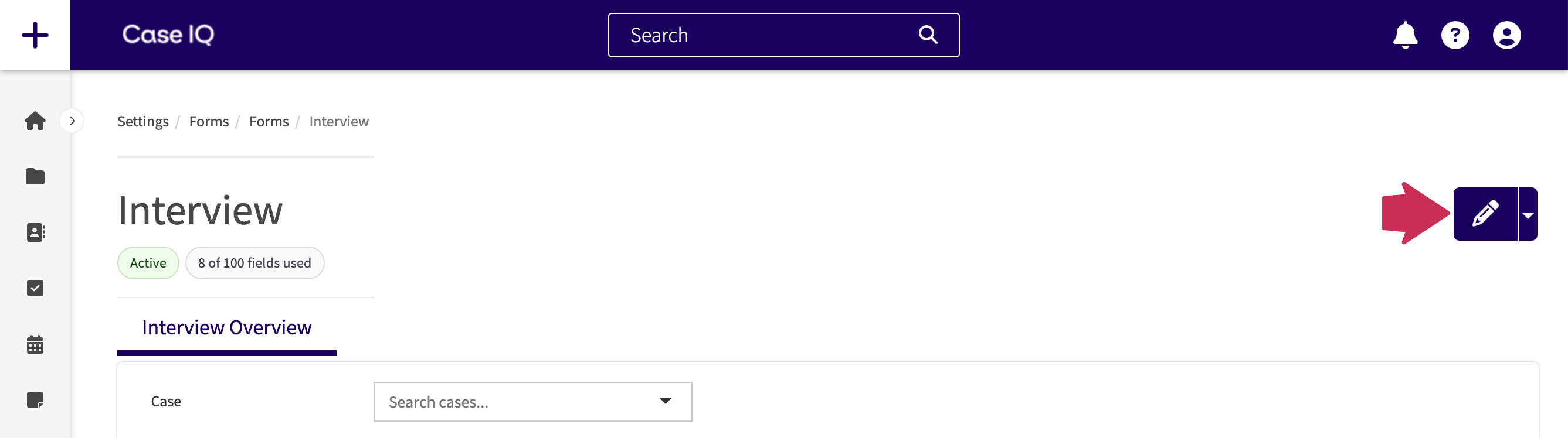
Click the Edit button in the Form Builder to modify an existing form.
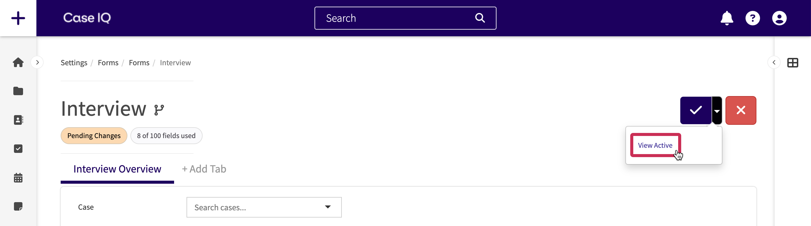
The form will now be in edit mode, so you can add, edit, move, and delete dynamic fields, sections, and tabs and edit the form’s properties. You can check the currently active version of the form while in “Pending Changes” status as well. Click the page menu and select “View Active”. Then you can return to edit mode by clicking the Edit button again.
Deactivate or Reactivate a Custom, Response, or Data Form
You cannot delete a custom or data form after it has been published but can deactivate it. You cannot deactivate standard forms.
What happens if you deactivate a form?
If you deactivate a custom form, users cannot add new or view custom form records.
If you deactivate a response form, users cannot add or request responses using the form and all pending requests for the response form will be cancelled.
If you deactivate a data form that has been added to a standard, response, or custom form:
- The data form section will remain on the standard, response, or custom form, but its search field will be removed. This means that users will not be able to look up the data form’s entries in the section.
- The data form section’s name will be replaced with “Unknown data form” on custom, response, and standard forms.
- You will not be able to add entries for the data form.
To set a custom, response, or data form to “Inactive” status, load the form in the Form Builder, click the Form Builder’s page menu, and select “Deactivate”. You can set an inactive custom or data form back to “Active” status by clicking the Publish button. Reactivating a custom or response form will restore all records of this type in the application. If you reactivate a data form, (1) the data form’s search field in its sections on standard, custom, or response forms will be restored and (2) you can add data form entries for it again.
Add a Field
You can add a maximum of 250 fields to a form. To add a field to a form:
- Click the + Insert Fields button or the right arrow icon to open the Field Type sidebar.
- The Field Type sidebar contains all available data types you can add to the form. See a glossary in the "Field Types" section below.
- Use the “Search field type…” search bar to find a specific data type in the list. To add a field type to your form, click and hold the field type in the Field Type sidebar, drag it to the Form Builder, and let go of your cursor over the + Insert Fields section.
- You will only be able to add field types that reference other data in the system, such as "Case Selection", "Party Selection", and "User" fields, to the internal only section on a response form. This means you will not be able to add them where external recipients will be able to see them.
- The field will be added to the page and the Field Type pop-up will be displayed, where you can fill in the field's properties. See a description of all field property options in the Field Type Properties section of this article.
- When you have finished entering the field properties, click Save on the pop-up. The field will now appear on the Form Builder.
Show Field When Adding a Record
If you want users to fill in a field when adding a record, like a new case, party, or custom form, turn on “Show on the internal intake form” in the Field Type pop-up. See details on all settings you can configure for fields in Field Type Properties.

Field Types
The Field Type sidebar on the Form Builder will contain all available data types you can add for the form type. See the chart below for a description of all field types and the forms on which they will be available:
| Field Type | Description of Field | Available On |
|---|---|---|
| Case Selection | A field allowing users to search and input an associated case number for the record. |
Custom forms Response forms (Internal Only) Standard forms |
| Checkbox | A field that the user can select a true (check) or false (unchecked) value. | All forms |
| Color | A color picker so the user can select a specific color value. | All forms |
| Coordinate | A map where the user can select a location, formatted as coordinates. |
All forms Internal Only for Response forms |
| Country | A picklist to select a country. | All forms |
| Data form section | A group of fields that a user can auto-populate with data form entries. See details in Add a Data Form Section to a Standard, Custom, or Response Form. |
Custom forms Response forms (Internal Only) Standard forms |
| Data lookup section | A container for which you can configure a lookup integration to populate data from an external source system. See details in the Set Up a Look Up Integration article. |
Custom forms Response forms (Internal Only) Standard forms |
| Date | A calendar date picker so that the user can easily input a calendar date. | All forms |
| Date and time | In addition to a calendar date picker, additional fields to input a specific time will be displayed. | All forms |
| Delay | Multiple fields to enter a numerical value and unit of time (hours, minutes, and days) to input an amount of time. | All forms |
| A text field where the user can type in one email address, with options to enter ad hoc emails or search for Case IQ user account emails. | All forms | |
| Email(s) | A group of email fields to enter a person’s work and personal email addresses. | All forms |
| Email multiple | A text field where the user can type in multiple email addresses, with the same options as “Email”. | All forms |
| Entity grid | A simplified grid of a case's records, where users can quickly add and review records. See Add an Entity Grid to the Case Form for details on entity grids. | Case form |
| ID number | A field to enter an identification number or name. Users cannot enter spaces or tabs in ID Number fields. | All forms |
| Information box | A text banner to provide notes or warnings to the user. |
Custom forms Response forms Standard forms |
| Integer | A field to enter a numeric value with no decimal. | All forms |
| Location | A group of fields to enter a location’s full address, including street address, city, state/province/territory, country, and zip/postal code. | All forms |
| Money | A field to input an amount of money. | All forms |
| Name - detailed | A group of text fields to enter a person’s full name, including first name, last name, and middle initial. | All forms |
| Number | A field to enter any numerical value. | All forms |
| Number range picklist | A dropdown list of each whole number in range. | All forms |
| Party selection | A dropdown list where the user can search and select a party name from the party records of the corresponding case. |
Custom forms Response forms (Internal Only) Case form Party form |
| Party selection multiple | A dropdown list where the user can search and select multiple party names from the party records of the corresponding case. |
Custom forms Response forms (Internal Only) Case form Party form |
| Personal information | A group of fields to enter a person’s full name, contact information, and location. | All forms |
| Phone number | A text field with validation to ensure proper phone number formatting. | All forms |
| Phone number(s) | A group of phone number fields to enter a person’s work, home, and mobile phone numbers | All forms |
| Phone number multiple | A text field where the user can enter multiple phone numbers. | All forms |
| Picklist | A dropdown list of set values where only one value can be selected. | All forms |
| Picklist multiple | A dropdown list of set values where multiple values can be selected. | All forms |
| Playbook | A text area in which Case IQ's Clairia AI will generate content. The Playbook field type will only be available if Clairia has been activated for your application. Contact your Customer Success Manager if you are interested in Clairia. | Case form |
| Postal code | A text field with validation to ensure postal code or zip code formatting. | All forms |
| Radio | A list of options where only one can be selected. | All forms |
| Secret | A text field where the value is hidden when inputted, like a password. The value appears when hovered over or focused on. | All forms |
| Section | A container where other fields can be placed to organize a form. See more details in Add, Edit, or Move a Section. |
Custom forms Response forms Standard forms |
| Team multiple | A field to select one or more teams. |
Custom forms Response forms (Internal Only) Standard forms |
| Text area | A large text field for narratives or summaries. | All forms |
| Text editor | A large text field where the user can format the text, e.g. bolding, underlining, or italicizing text and creating tables. | All forms |
| Textbox | A small text field where the user can enter one short answer. | All forms |
| Textbox multiple | A small text field where the user can enter multiple short answers. | All forms |
| Time | A field to enter a time value. | All forms |
| Toggle | A button where the user can select one of two available options. | All forms |
| URL | A text field containing a link. | All forms |
| User | A text field to input an existing Case IQ user. |
Custom forms Response forms (Internal Only) Standard forms |
| User multiple | A text field to input one or many Case IQ users. |
Custom forms Response forms (Internal Only) Standard forms |
Field Type Properties
In the following table, see a description of field property options and the forms on which they will be available:
| Field Property | Description of Field Property | Available On |
|---|---|---|
| Name | The field’s system name, i.e. the text that will be shown on grids and reports and used for templates to refer to the field. Entering a field name is required when adding a dynamic field. If you do not enter a “Caption”, the “Name” text will be displayed beside the field. | All forms |
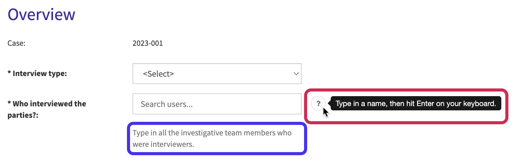
| Caption |
The text that appears beside the field on the form. Adding a caption is optional. If you enter a caption, the caption text will be displayed on the form instead of the “Name” text. For example, you can enter a concise name for the field in “Name” to show in grids and reports, such as “Interviewers”. Then, you can phrase the “Caption” text as a question to help users filling in the form, such as “Who interviewed the parties?”. |
All forms |
| Input Method |
Select if the field’s value can be entered by users or calculated. Choose one of the following options:
|
Custom forms Response forms Case form Party form Profile form User profile form |
|
Case form | |
| Required | Choose if users must complete the field before they can submit the form. | All forms |
| Show on the internal intake form |
Choose if the field should be displayed on the form to add a new record. If "Show on the internal intake form" is switched to "On", the field will appear on the New Form page of the form type. By default, the option is set to "Off", meaning that the field will not be available on the page when adding a new form. For response forms, “Show on the internal intake form” determines whether the field is shown to internal users when creating a response. Fields outside the internal only section will be displayed to external recipients on intake, even if you set "Show on the internal intake form" to "No". |
Custom forms Response forms Case form Party form Profile form User Profile form |
| Show on the external portal intake form | Choose if the field should be displayed on your application’s external portal (the Report Online form). If you do not see the "Show on the external portal intake form" toggle, the external portal has been disabled for your application. |
Custom forms Case form Party form |
| Show on Hotline | Choose if the field should be displayed on the Hotline Intake form for hotline agents submitting a case on behalf of a caller. If you do not see the "Show on Hotline" toggle, the external portal has been disabled for your application. |
Case form Party form |
| Restrict Edit | Prevent users from editing the field unless they have “Save Restricted Fields” or “Create Restricted Fields” permissions for the form. You can restrict a maximum of 20 application fields. This option is not available for information boxes, sections, or data form sections. |
Custom forms Case form Party form Profile form |
| Sub Text | Text that will be constantly displayed under the field. For example, you may want to provide clear and prominent instructions to complete the form. In the screenshot below, the field’s sub text is highlighted in purple. You can include URLs in the text, for which Case IQ will automatically create a link. Make sure to include “http://” or “https://” in the link. | All forms |
| Help Text | More discrete guidance text, which will only be displayed when the user hovers their cursor over a question mark icon beside the field. See an example highlighted in pink in the screenshot below. | All forms |
For certain data types, there will be additional options in the Field Type pop-up, where you can set more properties of the field. See the table below for details on the options you can set for each field type.
| Field Type | Additional Field Property Options |
|---|---|
| Case Selection |
If you add a case selection field to the case form, you can use the following options to set up Automatic Case Links for the field:
|
| Color | You can enter a default value to display in the field as a placeholder. |
| Coordinate |
You can set the following options to control what is displayed in the map location selector by default:
|
| Date |
You can select one of the following options to restrict the timeframe that users can input:
Any date constraints will be applied to date fields based on the user's timezone. For example, suppose you add a date field with a “past and present date” constraint and you have users in Sydney, Australia and Los Angeles, USA. If the current date is August 10 in Australia, but it is still August 9 in Los Angeles, Sydney users will be able to select August 10 in the date field, while Los Angeles users can select August 9. You can also enter a default value to display in the field as a placeholder. |
| Date and time |
You can select one of the following options to restrict the timeframe that users can input:
You can choose if Case IQ should track the user's time zone by their location when they enter a time value. If you disable timezone tracking, times inputted by users will be saved in universal time (UTC) and any date constraints will be applied based on the current time in UTC. Because of this, we recommend using timezone tracking if your organization has users across multiple timezones, especially timezones ahead of UTC. You can also enter a default value to display in the field as a placeholder. |
| Delay | You can enter a default value to display in the field as a placeholder. |
| Email Email multiple |
You can choose to link the field with system users, meaning Case IQ will automatically search through the application’s user accounts when a user enters text and pull a list of matching users. The user will also be able to add emails that are not linked to system accounts. For Email, you can enter a default value to display in the field as a placeholder. For Email multiple, you can also choose to link the field with system parties, meaning that Case IQ will search through party email addresses when the user enters text in the field. You can also set a maximum number of emails that users can select. |
| Entity grid | Select the entity for which you want to create an entity grid. You can select custom form, file, note, party, and to-do. See Add an Entity Grid to the Case Form for details on entity grids. |
| ID number |
|
| Information Box |
Select the information box type, which will change the background color of the information box:
|
| Integer Money Number |
Set the minimum and maximum numeric value. For Money and Number, you can choose the number of decimal places that can be inputted. |
| Number range picklist | Set the start and end values of the number range. |
| Phone number |
Choose if Case IQ should format the phone number with parentheses and hyphens (e.g. “(123) 456-7890”) or use an international format (e.g. “1234567890”). You can also select an international prefix in “Fixed Country Code”. Users will not be able to select a country code in the field if you enter a Fixed Country Code. You can enter a default value to display in the field as a placeholder. |
| Phone number multiple | Choose if Case IQ should format the phone number with parentheses and hyphens (e.g. “(123) 456-7890”) or use an international format (e.g. “1234567890”). |
|
Picklist Picklist multiple |
Create custom picklist options to display in the dropdown directly from the Field Type sidebar. See Add a Picklist Option for details. When adding a picklist or picklist multiple field to the case form, you will see the "Available For Case Filtering" toggle. See Manage a User Role: Set up Case Filters to learn how to set up case filters to restrict the kinds of cases a user role can access. You can enter a default value to display in the field as a placeholder. |
| Playbook | Select the “Playbook”, which is a custom set of instructions, Clairia will use to generate content in the field. You can select any Playbook configured in your application (see details on creating Playbooks in Customize Playbooks for Clairia). Our default Playbooks, case summary, case timeline, and investigation next steps, will be available out-of-the-box (learn more about these in Example Playbooks). |
| Postal code |
Choose the “Country” to set the postal code formatting. The following options will be available by default, but your application may include additional countries:
You can enter a default value to display in the field as a placeholder. |
| Radio |
You can choose to display the options in a horizontal or vertical list and have one of the radio buttons selected by default. The default maximum number of options for a single radio field is 10. You can enter a default value to display in the field as a placeholder. |
| Secret |
Choose if users should be able to see the text they enter in the field when adding or editing a record on the form by hovering their cursor over or focusing on the field. You can enter a default value to display in the field as a placeholder. |
|
Text area Text Editor Textbox |
Enable automatic translation to have translations generated for the field when the form is submitted. The field's “Input Method” must be set to “Submit-Only”. The automatic translation option is only available for text area, text editor, and textbox fields on custom forms or the case or party form. See Set Up Automatic Translation for details. For text area and textbox fields, you can specify a minimum and maximum character value. You can enter a default value to display in the field as a placeholder. |
| Textbox multiple |
You can specify a minimum and maximum character value. You can display placeholder text. |
| Time |
Choose if the user should enter the time following the 24-hour clock (e.g. “13:00”) or 12-hour clock (e.g. “01:00 PM”). You can enter a default value to display in the field as a placeholder. |
| URL | You can enter a default value to display in the field as a placeholder. |
| User |
Choose a filter option to limit the users that can be entered. E.g. set the filter to “Super User” to ensure users select a Super User for the record. You can enter a default value to display in the field as a placeholder. |
Edit a Field
To update a form field’s properties, click the field on the Form Builder when the form is in edit mode. The sidebar will load the properties of the field. Complete your adjustments as needed and click the Save button at the bottom of the sidebar.
Add a Picklist Option
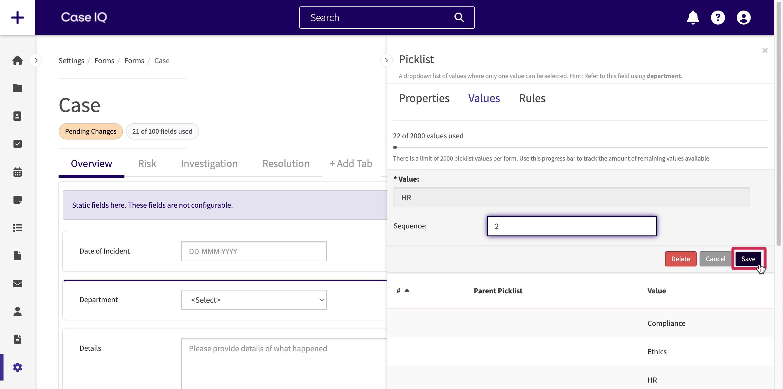
After adding a picklist type field, you can set the options to display in the picklist dropdown menu using the following steps. Any picklists created in the Form Builder will be populated in the Picklists page in Settings (see Configure Picklist Options). You can add a total of 3500 options across all a form's picklist and picklist multiple fields.
- Click the picklist field on the Form Builder to open the field’s properties on the sidebar.
- Click the Value tab on the sidebar.
- In the “Value” field, type a picklist option to show in the picklist dropdown menu, then hit Enter or Return on your keyboard. As shown later in this section, you can also paste a list of items in the Text field.
- Using the “Sequence” field, you can indicate the position in the picklist menu in which the option should appear by entering a number. If you do not add a sequence number, the options will be sorted alphanumerically.
- If you are editing a form and picklist field that are available on your application's portal, you will see an additional “Show on the external portal intake form” toggle in the field properties sidebar. You can turn this toggle on to show a picklist option on the application's portal so that portal users can see the value in the picklist dropdown.
- Click the Add button to add the option to the picklist.
Using the Form Builder, you can quickly add values to picklists in bulk. Copy a list, then paste the list in the Text field and click the Add button. Case IQ can add up to 100 values at once, so if you need to include more than 100 values in the picklist, you will need to copy and paste values in the Value field multiple times.
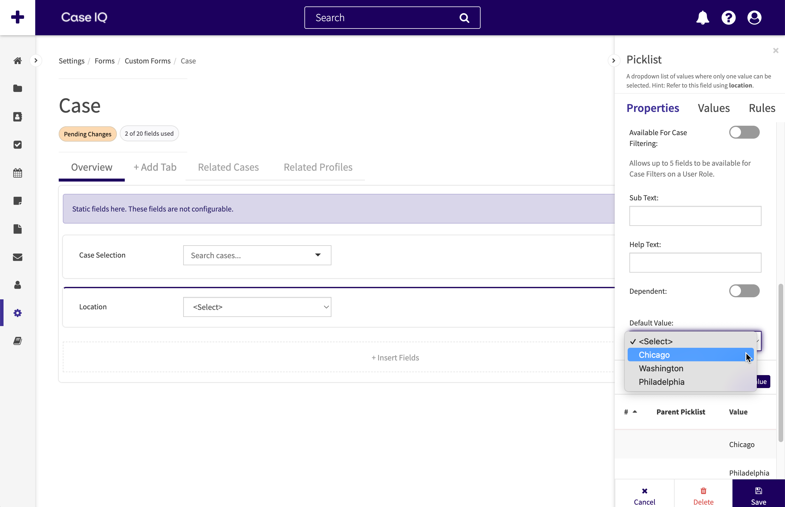
After adding options for a picklist, you can choose to display one of the picklist's options by default on the record type's form before a user selects an option. On the Form Builder, click the picklist field for which you want to set a default value. In the “Default Value” dropdown, select a value from the picklist you want Case IQ to display by default.
Editing Picklist Options
You cannot update the “Value” field of a picklist option for data integrity purposes. If you made an error typing in a picklist option's “Value” field, delete the picklist option, then add a new option with the correct “Value”.
To change the order in which the option is displayed, click the picklist option in the sidebar's Values tab, enter a number in the “Sequence” field, and click the Save button above the grid.
Set Up a Dependant Picklist
You can create a picklist whose values are dependent on options in an earlier picklist on the form, or a “dependent” picklist. See the steps below to create a dependent picklist and read more on primary and dependent picklists in Configure Picklist Options.
- On the Properties tab, click the “Dependent” toggle. A dropdown menu will appear under the “Dependent” toggle, where you can select the primary picklist. The primary picklist must already be added to the Form Builder before you can set dependent values in this picklist. Click the sidebar’s Save button.
- Click the Value tab. The primary picklist will be displayed above the “Text” and “Sequence” fields. Select a value from the primary picklist. Then, enter the values that should appear in the dependent picklist when that primary value is selected.
- In the example below, when the user selects “Ontario” in the “Region” picklist, the following options will be displayed in the “Location” picklist: “Barrie”, “Windsor”, and “Ottawa”.
- Click the Add button to create the dependent picklist values. You can review the picklist values and their primary values in the tab’s grid.
- Click the sidebar’s Save button to save all picklist values for the dependent picklist.
Move a Field
You can change the order of fields on the form. Click and hold a field, move your cursor to another location, then let go of your cursor to place the field.
If your form has more than one tab, you can move a field to another tab by dragging the field to the tab name and dropping the field on the Form Builder.
Delete a Field
You can delete a field on the Form Builder using either of the following methods:
- Hover your cursor over the field on the Form Builder and click the Delete icon.
- Click the field on the Form Builder, then click the Delete button on the left sidebar.
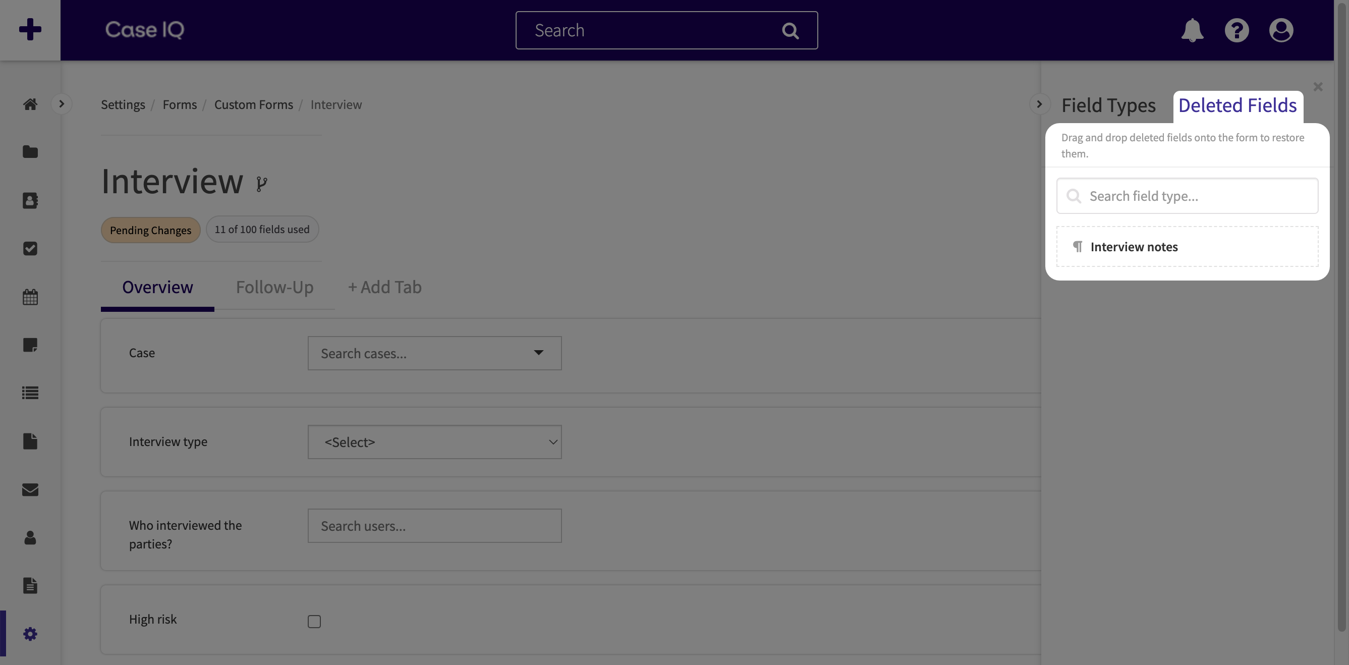
Restore Deleted Fields
If you delete a field after the form was published, you can restore it by clicking the “Deleted Fields” tab on the Field Type sidebar. Deleted fields will not appear on records or in search results, but the field data will not be deleted in the Case IQ system.
Add a Field Group
A field group is a linked group of fields that capture multiple attributes about one person or location. For example, the "Location" field group contains fields for street address, city, state, country, and zip code. You can add, edit, rearrange, and delete field groups just like individual fields.
To add a field group to a form:
- Click the + Insert Fields section or the right arrow icon to open the Field Type sidebar. All field groups are at the top of the sidebar's list.

- Click and hold a field group in the Field Type sidebar, drag it to the Form Builder, and let go of your cursor over the + Insert Fields section.
- In the field group pop-up, fill in the following fields:
- Caption: type in the text to display in the field group header.
- Show on the internal intake form: choose if the field group should be displayed when a user is creating a new record.
- For example, if you add a field group to a custom form called "Interview" and set "Show on the internal intake form" to "On", the group will appear on the New Interview Form when a user wants to add an interview record.
- By default, "Show on the internal intake form" is set to "Off", meaning that the field group will not be available on the form when adding a new record.
- If you want to show any of the group's fields on intake, set the field group to “Show on the internal intake form”. Then, you can choose the specific fields you want to show on intake by editing each field's properties in the group.
- For response forms, “Show on the internal intake form” determines whether the field group is shown to internal users when creating a response. Fields groups outside the internal only section will be displayed to external recipients on intake, even if you set "Show on the internal intake form" to "No".
- Show on the external portal intake form: choose if the field group should be displayed on your application’s external portal (the Report Online form).
- Show on hotline: choose if the field should be displayed on the Hotline Intake form for hotline agents submitting a case on behalf of a caller.
- Help text: enter discrete guidance text, which will only be displayed when the user hovers their cursor over a question mark icon beside the field group.
- When you have finished selecting the field group's properties, click Save on the pop-up. The field group will now appear on the Form Builder. You can now edit the properties of each field in the group separately, just like any other field.
Edit a Field Group
After adding a field group to a form, you can change the field group's properties. To update a field group’s properties, click the field group on the Form Builder. The sidebar will load the properties of the field group, where you can edit the field group's caption, change the intake channels for which it will be displayed, or create display rules. Click the Save button at the bottom of the sidebar.
Move a Field Group
You can change the order of field groups on the form and the fields within the group. You can even move other fields on the custom form into the group. However, you cannot move fields originally part of the group out of the section.
To move the entire field group, click and hold the group, move your cursor to another location, then let go of your cursor to place the field group. You can rearrange its fields in the same way by dragging and dropping them within the group. If your form has more than one tab, you can move a field group to another tab by dragging the group to the tab name and dropping the field on the Form Builder.
Delete a Field Group
You can delete a field group on the Form Builder using either of the following methods. Deleted field groups will not appear on records or in search results, but any data that users entered in the group's fields will not be deleted in the Case IQ system. You cannot restore a group or its fields after deleting a field group.
- Hover your cursor over the field group on the Form Builder and click the Delete icon.
- Click the field group on the Form Builder, then click the Delete button on the left sidebar.
Add a Tab
You can organize long and complex custom and case forms by adding tabs at the top of the page. Users can click through the tabs to see additional fields.
Tabs on the Case Form and Custom Forms
You can only add tabs for custom forms and the case form. You can add up to 6 tabs to a form. For the case form, this means you can add 6 tabs in addition to the default “Overview” tab.
To add tabs to a form:
- Click the + Add Tab button. When adding a tab to a custom form, any fields and sections currently on the form will be added to the first tab. Any additional tabs will be empty when they are created.
- In the New Tab pop-up, fill in the following fields, then click the Save button:
- Caption: type in the text to display on the tab header.
- Show on the internal intake form: choose if the tab should be displayed on the form to add a new record. If "Show on the internal intake form" is switched to "On", the tab will appear on the New Form page of the form type.
- Show on the external portal intake form: for the case form, choose if the tab should be displayed on your application’s external portal (the Report Online form). If you do not see the "Show on the external portal intake form" toggle, the external portal has been disabled for your application.
- Show on Hotline: for the case form, choose if the tab should be displayed on the Hotline Intake form for hotline agents submitting a case on behalf of a caller. If you do not see the "Show on Hotline" toggle, the external portal has been disabled for your application.
- The tab will be added. Click the + Add Tab button to create more tabs.
Move a Tab
You can reorder tabs just like fields. Click and hold the tab caption, then move your cursor to the left or right. Let go of your cursor when the tab is in the desired position.
Edit or Delete a Tab
You can update the tab properties by hovering over the tab caption and clicking the Edit icon. The tab’s properties will appear on the sidebar, where you can edit the tab’s caption, change the intake methods for which it will be displayed, create display rules (read more in Set up a Display Rule), or delete the tab. When you delete a tab, its fields and sections will be deleted too. Fields that have not been published will be permanently deleted. However, you cannot delete locked tabs.
However, you cannot delete locked tabs. To check if a tab is locked, hover over a tab to confirm if there is a lock icon.
Add a Section
Organizing your standard, custom, or response form into sections can make long records easier to read. You can also create complex, dynamic forms by adding rules for when to show sections (refer to the Set up a Display Rule section of this article for steps).
To add a section:
- Find the “Section” field type at the bottom of the Field Type sidebar.
- Drag the “Section” field type to the Form Builder.
- In the New Section pop-up, enter a name for the section in the “Caption” field. You may choose to hide the section on intake, similar to forms and tabs.
- Click Save to create the section.
The section will contain its own + Insert Fields box, where you can move or add fields.
Move a Section
Similar to fields, you can rearrange the order of the section on the form by clicking, holding, and dragging the section to a new location. To move a section to another tab, click and hold the section and drag it to the tab header, continuing to hold the section. Then move the section to the location you would like to place it on the tab’s Form Builder and let go of your cursor.
Set up a Display Rule
You can use display rules to create context-sensitive forms that react to user input. Display rules control when a user can add a custom or response form type for a case or when a field, section, or tab is available on the form. Case IQ will show the field, section, tab, or the option to add a custom or response form type when the display rule's criteria are met. You can also create complex display rules to describe multiple, separate scenarios in which a field, section, tab, or custom or response form should be shown.
Display Rules for Fields, Sections, and Tabs
You can specify when a field, section, field group, or tab should be displayed on the record based on other field values entered by the user. If you add display rules to a section or field group, the rules will apply to all fields in the section. Additional visibility rules may be applied to the section’s fields, but the section’s rules will take priority.
Field Values Reset When Hidden
When Case IQ hides a field based on your field, section, or tab display rule criteria, the system will remove the field's value. For example, if the field is initially shown on the form, then hidden due to the field's display rules, any information entered into the field will be deleted.
To create display rules for a field, section, field group, or tab:
- For a field, field group, or section, click the field, group, or section on the Form Builder to load its properties on the sidebar. For tabs, click the Edit icon.
- Click the “Rules” tab in the sidebar, then click the Add Display Rule button.
- In the Display Rules pop-up, use the “Search fields…” dropdown menu to select another field on the form on which to base the display rule, or the “parent field”.
- Choose an operator for the statement, or a logical phrase telling the system how to search for the keywords or values you will enter in the next box, e.g. “contains”, “is”, or “is not”. The operator options available depend on the data type of the field chosen in the “Search fields…” dropdown.
- Type in or select the value of the parent field for when the dependent field, section, or tab should be displayed. In the example below, the “Region” field will only be displayed when the “In-person?” checkbox is checked. The keyword or value input method depends on the record field data type chosen in the “Search fields…” dropdown.
- If the display rule should be dependent on more than one field, you can add parent fields by clicking the + Criteria button.
- Using the “All/Or toggle”, you can set whether the record must meet all or one of the statements on your list.
- By selecting “All”, the field, section, or tab will be displayed only if all criteria statements are met.
- Choosing “Or” means that the dependent field, section, or tab will be displayed even if only one of your criteria is met.
When you have completed setting up criteria, click the Save button on the Display Rule pop-up. If you added a display rule for a field, a connector icon will appear beside the field.
After saving one display rule for the field, section, field group, or tab, you can add more display rules to show the field, field group, section, or tab in multiple different situations. Click Add Display Rule again, set up another display rule in the Add Display Rule pop-up, and click Save. There will now be an "And/Or" toggle under the display rules.
- If you select "And", the entity will not be displayed unless all of your display rules are met.
- If you choose "Or", the entity will be displayed if it meets one of your display rules.
Display Rules for Custom and Response Forms
You can define for what cases users will be able to add a custom or response form type based on the case’s fields. If you create display criteria for a custom or response form, users will only see the option to add the form type for cases that meet your criteria. For example, suppose your application contains an “Interview” custom form type to document the proceedings of case interviews. Using display rules, you can ensure users are only able to add “Interview” records for relevant cases, based on the “Case Type” field. You can set the “Interview” custom form’s display rules to only show the option to add “Interview” records when the case type is “Investigation”. The option will be hidden when the case is set to any other type.
To create display rules for a custom or response form:
- Hover over the form’s name and click the Edit icon.
- Click the “Rules” tab in the sidebar, then click the Add Display Rule button.
- In the Display Rules pop-up, use the “Search fields…” dropdown menu to select the case form field on which to base the display rule.
- Choose an operator for the statement, or a logical phrase telling the system how to search for the keywords or values you will enter in the next box, e.g. “contains”, “is”, or “is not”. The operator options available depend on the data type of the case field chosen in the “Search fields…” dropdown.
- Type in or select the value of the case field for when the option to add records of this custom form type should be displayed. In the example below, the option to add an "Interview" custom form will only be displayed when the “Case Type” field is set to "Investigation". The keyword or value input method depends on the record field data type chosen in the “Search fields…” dropdown.
- If the display rule should be dependent on more than one field, you can add more case fields by clicking the + Criteria button.
- Using the “All/Or toggle”, you can set whether the record must meet all or one of the statements on your list.
- By selecting “All”, the option to add a custom form type will be displayed only if a case meets all criteria statements.
- Choosing “Or” means that the option to add a custom form type will be displayed even if the case only meets one of your criteria.
- When you have completed setting up criteria, click the Save button on the Display Rule pop-up.
If you change the case’s properties on which a custom or response form’s display rules depend, any existing custom or response forms will be retained and you will still be able to access them. However, as the case will no longer meet the display rule's criteria, you will not be able to add more custom or response form records of that type.
Similar to fields, sections, and tabs, you can add multiple display rule for a custom or response form to show the option to add a record in multiple different specific situations. Click Add Display Rule again, set up another display rule in the Add Display Rule pop-up, and click Save. There will now be an "And/Or" toggle under the display rules.
- If you select "And", the custom or response form option will not be displayed unless all your display rules are met.
- If you choose "Or", the custom or response form option will be displayed if it meets one of your display rules.
Edit a Form's Properties
You can edit a form’s properties, such as its name or whether to show it on intake. Hover over the form’s name and click the Edit icon. See the chart below for a description of all form properties and the forms on which they will be available. You cannot edit the properties of the case, profile, or user profile forms.
| Form Property | Description of Property | Available On |
|---|---|---|
| Caption | The unique name of the form. | All forms |
| Caption Plural | The plural form of the form’s name. | All forms |
| Show on the internal intake form | Toggle to display or hide a custom form or the party form on the New Case form. You can have a total of 5 forms on intake, including the party form. |
Custom forms Response forms Party form |
| Add Parties on Portal | Toggle to allow users of your application's external portal to add parties when they submit a case. | Party form |
| Add Parties on Hotline | Toggle to allow hotline agents to add parties when they submit a case on behalf of reporters. | Party form |
| Show on the external portal intake form |
For custom forms, toggle to allow users of your application’s external portal to add custom forms when they submit a case. You can have a total of 5 forms on the portal, including the party form if you have turned on the “Show Parties on Portal” option for the party form. For data forms, toggle to allow users of your application’s external portal to use this data form to populate fields on the Report Online form and see this data form’s entries. |
Custom forms Data forms |
| Automatic Translation | Toggle to display the “Automatic Translation” field property for text fields in the Form Builder. If you enable “Automatic Translation” for a text field, Case IQ will automatically generate translations for text in a different language than your application's default language when the custom form is initially submitted. See Set Up Automatic Translation for details. |
Custom forms Response forms |
| Sequence | If the custom or party form is set to show on the internal intake or external portal form, you can choose the order in which the form will be displayed. For example, if you enter “2”, it will be the second form displayed on the New Case and Report Online forms. |
Custom forms Response forms Party form |
| Show on Hotline | Toggle to allow hotline agents to use this data form to populate fields on the Hotline Intake form and see this data form’s entries. | Data forms |
| Lookup | Activate and configure a lookup integration to retrieve data from an external source system and populate it in the form’s fields. See the Set Up a Look Up Integration article for details. |
Custom forms Party form Profile form |
| Rules tab | Set the conditions under which Case IQ should show the option to add a custom form on the case’s page (see Set up a Display Rule). |
Custom forms Response forms |
Link a Field on the Party and Profile Forms
As organizations often use parties and profiles to store similar information, System Administrators can choose to allow users to create party records from profile records and vice versa (see Options for details on enabling this for users and Create a Profile when Adding a Profile and Add a Party: Fill in the New Party Form with a Profile for instructions on populating forms with other records). Using the Form Builder, you can add a field that is connected to both the profile and party forms. This means that if you add a party and choose to create a linked profile, the field on the Profile form will be populated with the information entered in the Party form and vice versa.
In the example below, the “Employee ID” field was added to both the Party and Profile forms via the Form Builder. “Brett Rogers” is added as a party with an Employee ID of “00978”. A linked profile is created when the party is saved, so the Brett Rogers profile’s salary field is populated as “00978”.
To create a connected party and profile field, make sure the field:
- Is the same type, e.g. text box, radio, date, etc., in both the Party and Profile forms.
- Has the same text in the “Name” field (not case sensitive).
However, you can set different “Captions”, “Sub Text”, “Help Text”, and properties for the mapped field in each form. Changing the translations of mapped fields does not change the field’s “Name” in the Form Builder or the text displayed on the Party and Profile forms, but it will change the text used in grids and reporting.
Set up an Aggregate Field on the Case Form
You can summarize information from a case's records (e.g. parties, files, custom forms, etc.) on the case's page by adding an “aggregate” field type to the case form layout. When setting up an aggregate field, you can tell the system how to calculate the aggregate field's value by choosing the data field the system should pull from a case's records and the method it should use to evaluate the data. You can create aggregate fields to summarize key data, including the following examples:
- Display the most selected “Country” for the case’s parties.
- Add up the total expenses of the case from the case’s “Expense” records.
- Summarize the number of hours spent investigating the case by averaging the “Timesheet” records entered by each case worker.
Like all other data fields in Case IQ, you can add aggregate fields to document templates (see Create and Upload a Document Template), Yellowfin reports, and grid layouts (see Grids), meaning that you can easily include summaries of record data in generated documents, reports, and grids.
Max 9 Aggregate Fields Per Child Record Type
You can add a maximum of 9 aggregate fields to the case form for each child record type. For example, on your case form, you could add 9 fields to aggregate party data, 9 aggregate fields for files, and 9 aggregate fields for to-dos.
Add an aggregate field to the case form layout via the Form Builder using the following steps:
- Click the + Insert Fields button or the right arrow icon to open the Field Type sidebar.
- The Field Type sidebar contains all available data types in Case IQ. Use the “Search field type…” search bar to find the data type of the record field you want to aggregate. In the example below, a money field on a custom form type, “Expense”, will be aggregated, so a money field was added to the case form layout to set up as an aggregate field.
- You can aggregate most data types excluding: “Case Selection”, “Coordinate”, “Email Multiple”, “Party Selection”, “Phone Number Multiple”, “Team Multiple”, “Text Box Multiple”, “User”, and “User Multiple”.
- To add a field type to your form layout, click and hold the field type in the Field Type sidebar, drag it to the Form Builder page, and let go of your cursor over the “+ Insert Fields” section.
- The field will be added to the page and the Field Type pop-up will be displayed. Below the “Name” and “Caption” fields in the Field Type pop-up, you will see the following radio options: “Editable”, “Computed”, and “Aggregate”. Select “Aggregate” to set up an aggregate field.
- After selecting “Aggregate”, the following dropdown fields will be displayed:
- Child Record Type: select the record type that contains the data you want to summarize on the case’s page. You can choose any standard record type (i.e. parties, files, notes, emails, appointments, and to-dos) or custom forms configured in your application.
- Aggregation Method: choose the method by which the system should calculate the aggregate field. The options available in this dropdown depend on the data type of the field you have added to the case form.
- You can aggregate any data type with the following methods: “First”, “ISEL Expression”, and “Most Recent”. By selecting “ISEL Expression”, you can define the calculation that the system should run to determine the value of the aggregate field. For example, you could aggregate an email field on the party form by concatenating them into a list. See the Case IQ Expression Language guide to learn how to write expressions.
- There will be additional aggregation methods available for some data types that are appropriate for the kind of data they store. For example, you can find the average or sum of numbers, most common picklist choice, or most recent date value. See the Additional Aggregate Field Data Types table below for a full list.
- Target Field: tell the system what field on the record form you want it to use in calculating the aggregate field value. This dropdown menu will display all fields in the selected record type that match the aggregate field’s data type.
- For example, if you choose to create a “Date” aggregate field and select “Party” in the “Child Record Type” field, the following static fields will be displayed in the “Target Field” dropdown: Created Date, Date of Birth, Date Purged, Date Submitted, Last Updated Date, and Pending Purge Date. Any dynamic date fields on your application's party form will also be displayed.
- Click the Save button in the field pop-up to record your aggregate field configurations.
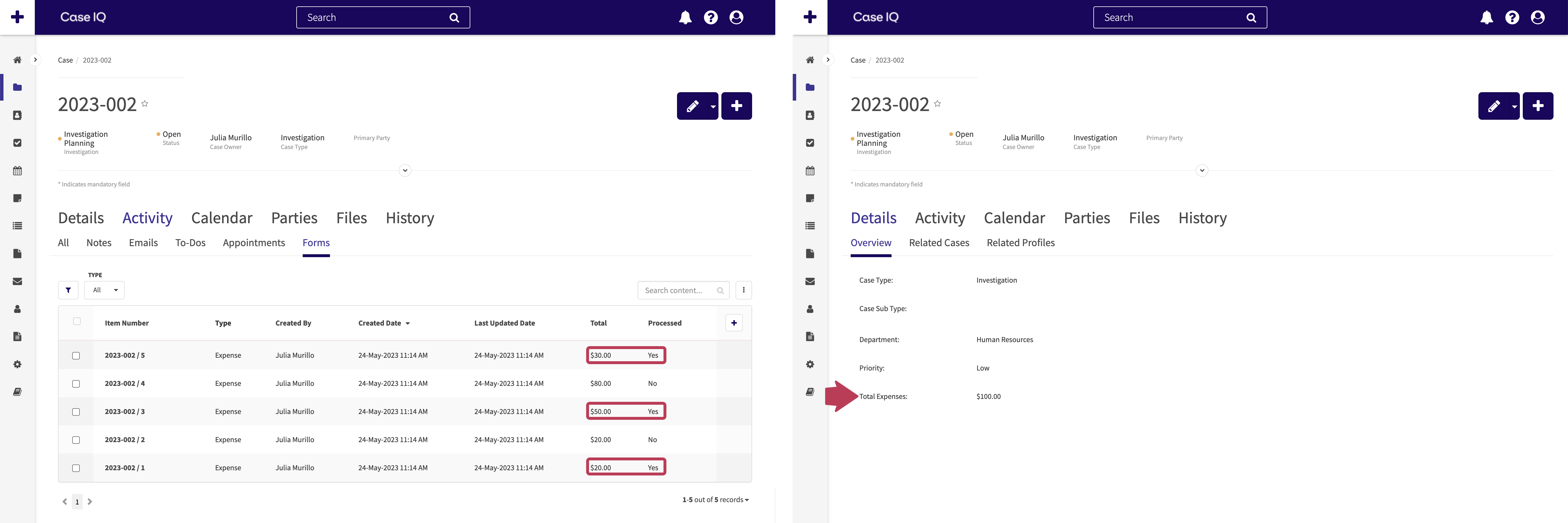
- After saving an aggregate field, you can choose to filter the kinds of records that will be included in the aggregate field value calculation. In the example below, the total expenses of a case, where the "Expense" record has been set to "Processed" will be calculated, rather than summing all "Expense" records added for the case.
- Click the aggregate field in the Form Builder.
- Under the "Target Field" dropdown, you will see the following message: "There are currently no filters applied. Click here to add filters." The Add Filters pop-up will be displayed when you click the Here link.
- The Add Filters pop-up contains the following fields with which you can set up a record filter:
- The "Search fields..." dropdown will contain all fields on the record type selected for the aggregate field. Choose the record field that the system should check before it includes or excludes the record in the aggregate field value calculation.
- Choose an operator for the statement, or a logical phrase telling the system how to search for the keywords or values you will enter in the next box, e.g. “contains”, “is”, or “is not”. The operator options available depend on the data type of the field chosen in the “Search fields…” dropdown.
- Type in or select the value of the record field for when the target field should be included in the aggregate field value calculation. The keyword or value input method depends on the record field data type chosen in the “Search fields…” dropdown.
- Click the Save button on the Add Filters pop-up. You can add multiple filters for an aggregate field by clicking "+" beside "Filters Applied". If you add another filter, you can use the "And/Or" toggle to indicate if the record must meet all or just one of the filters to be included in the aggregate field calculation.
- Publish the case form layout to finish adding the aggregate field to the case form.
The aggregate field will now be available on the New Case form and a case’s page. The system will calculate the value to populate in the aggregate field when a case is saved on either page. In the example below, “Total Expenses” is an aggregate field that adds up the “Total” field values for the case's Expense records. However, only Expense records where “Processed” is set to “Yes” are included in the “Total of Expenses” calculation.
Additional Aggregate Field Data Types
| Field Types | Aggregation Methods Available | Result |
|---|---|---|
|
Checkbox Toggle |
And | The “Yes” or “No” result if all target field values had “and” between them. |
| At least one | Returns “Yes” if there is at least one target field value. | |
| Or | The result if all target field values had “or” between them. | |
|
Date Date and time Time |
Earliest | The target field value that occurs earliest, meaning it happens before all other record target field values. |
| Latest | The target field value that occurs latest, meaning it happens after all other record target field values. | |
| Next | The target field value that is the same or the closest value occurring after the date and time that the aggregate field is calculated. | |
| Previous | The target field value that is the same or the closest value occurring before the date and time that the aggregate field is calculated. | |
|
Delay Integer Money Number Number range picklist |
Average | The mean numeric target field value. |
| Count | The number of target field values. Their values are not included. | |
| Highest | The greatest target field value. | |
| Lowest | The lowest target field value. | |
| Median | The middle target field value among the records. | |
| Most common | The most frequently occurring target field value. | |
| Sum | The product of adding all target field values. | |
| Picklist | Most common | The most frequently occurring target field value. |
Add a Data Form Section to a Standard, Custom, or Response Form
You can add a data form as a section in a standard, custom, or response form, so users can look up information and populate the data form’s fields.
Final Data Form Configuration Step
Adding a data form section to a standard, custom, or response form is the final step in setting up a data form. Before adding a data form section, make sure to:
- Add a data form template (see Set up a Data Form: Add a Data Form Template).
- Add entries for the data form (see Set up a Data Form: Add a Data Form Entry).
To add a data form section to a standard, custom, or response form, find “Data Form Section” at the bottom of the Field Type sidebar and drag it to the Form Builder page. In the New Data Form Section pop-up, fill in the following fields:
- Caption: enter the name for the data form section that you want Case IQ to display on the standard, custom, or response form.
- Data form: choose the data form template you want to add to the standard, custom, or response form.
- Show on the internal intake form: toggle to display or hide the data form section when adding a new record. If you want to show any of the data form’s fields on intake, set the section to show on the internal intake form. Then, you can choose the specific fields you want to show on intake by editing properties of the fields in the data form section.
- Show on the external portal intake form: toggle to display or hide the data form section’s fields on your application’s external portal. You can set this independently from the data form template.
- If you choose to hide a data form template for the portal but show its data form section on a standard form for the portal, portal reporters will see the section’s fields on the Report Online form but will not be able to auto-populate the section. The data form section will be editable on the Report Online form, even if you set it as “Read Only” on the standard form. This means that a portal reporter can manually enter data into the data form section’s fields but will not see the data form’s entries.
- If you want to show any of the data form’s fields on the portal, set the section to show on the portal. Then, you can choose the specific fields you want to show on the portal by editing properties of the fields in the data form section.
- Show on hotline: toggle to display or hide the data form section’s fields on the Hotline Intake form.
- Like the “Show on the external portal intake form” option, if you choose to hide a data form template on the Hotline Intake form but show the data form section on the hotline, hotline agents will see the data form section on the Hotline Intake form but will not be able to auto-populate the fields or see the data form entries.
- If you want to show any of the data form’s fields on the Hotline Intake form, set the section to show on hotline. Then, you can choose the specific fields you want to show on the Hotline Intake form by editing properties of the fields in the data form section.
- Help text: enter any guidance text for the data form. Help text will be displayed when the user hovers their cursor over a question mark icon beside the section.
Click Save to create the data form section. The fields of the data form template you selected will be added to the standard, custom, or response form and they will be available for General Users when you publish the standard, custom, or response form.
If you click a data form section field, you can edit its properties like any other form field (see the Field Type Properties section of this article for a list of field properties). There will be 2 additional field properties for data form fields:
- Read Only: by default, data form section fields will not be editable, meaning that the field can only be auto-populated and users cannot change the field’s value. If “Read Only” is disabled, users can change the data form section field’s value.
- Mapped field: choose the data form field to auto-populate in the section’s field. Your “Mapped Field” selection tells Case IQ what data it should put in the field when a user auto-populates the data form section.
A field’s name or caption on the data form section does not need to match the data form template field to which it is mapped. The “Mapped Field” dropdown will list all fields on the data form template with the same data type as the field you are editing. In the example below, the “First Name” field in the data form section is a textbox, so the options in the “Mapped Field” dropdown are the textbox fields on the data form template. You can map the same data form field to multiple fields in the data form section.
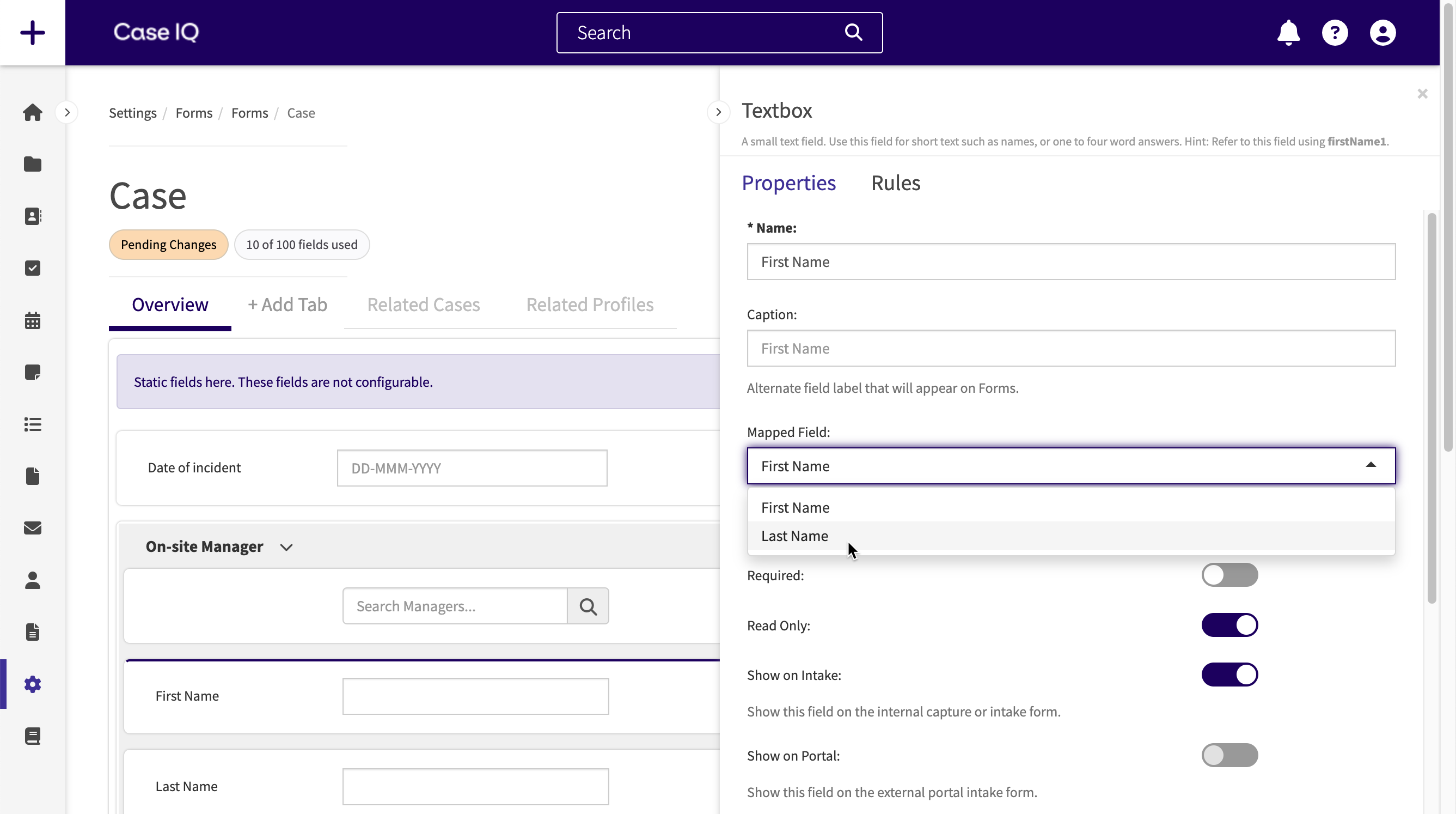
Unmapped Fields
You do not have to map every field in a data form section, but unmapped fields will not get auto-populated. Make sure to disable “Read Only” for unmapped fields, otherwise users cannot fill them in.
You can move a field within the data form section or out of it by clicking and holding a field, moving your cursor to another location, then letting go of your cursor to place the field. If you move a data form section field out of the section, its “Mapped Field” value will be removed. You can also move other fields into a data form section. Case IQ will add the “Mapped Field” property for the field, but it will be blank by default.
Delete Data Form Section Fields
You can delete data form section fields like any other form field by clicking the Delete button beside the field or on the left sidebar. Deleting fields in the data form section will remove the field for the standard, custom, or response form but will not affect the data form template or its entries.
Publish a Form
When you are ready to set your form to “Active” click the Publish button on the Form Builder. A pop-up will be displayed to confirm that you would like to proceed with publishing the form. Click Confirm to proceed.
The form will now be in “Active” status. If you created a custom or response form type or edited a standard, custom, or response form, users can now create records using the new or updated form. If you added a data form template, you can now add entries for the data form (see Set up a Data Form: Add a Data Form Entry).
When you initially publish a new custom or response form type, Case IQ will add user role permissions to create, edit, remove, and view records of the new custom or response form. Similarly, Case IQ will add user role permissions to view entries of a newly created data form when you first publish a data form template. No user roles will have access to the new custom form or data form entries yet, as you must manually grant permissions on a User Role’s page (see User Roles for details on adjusting user role permissions).
Field Translations
The application will automatically update the translations data, meaning that the captions of new fields will be added and any existing fields that have been updated will be synced with the translations table.