Create a Report
In Yellowfin, you can create reports to pull together case data contained in Case IQ into tables or charts for analysis. You can format the report table to highlight important data and show the relationship between multiple data sets to showcase trends. After creating a report, you can add it to a dashboard for quick access on your Reports home page (see Dashboards) or share it with other individuals to communicate your findings (see Share a Report).
Create a Report
You can create a report with Yellowfin's Drag and Drop Report Builder, which you can access on any page in the Yellowfin application by clicking the Plus button in the top right of the page, then selecting the “Report” option.
In the New Report pop-up, select a “view”, which are sets of data from the Case IQ application. Generally, you will have 1 to 3 views available from which to choose, depending on how your Case IQ application is configured. After selecting a view, the Drag and Drop Report Builder will be loaded.
Drag and Drop Report Builder Features
The main elements on the Drag and Drop Report Builder page are numbered in the screenshot below and descriptions are provided following the image.
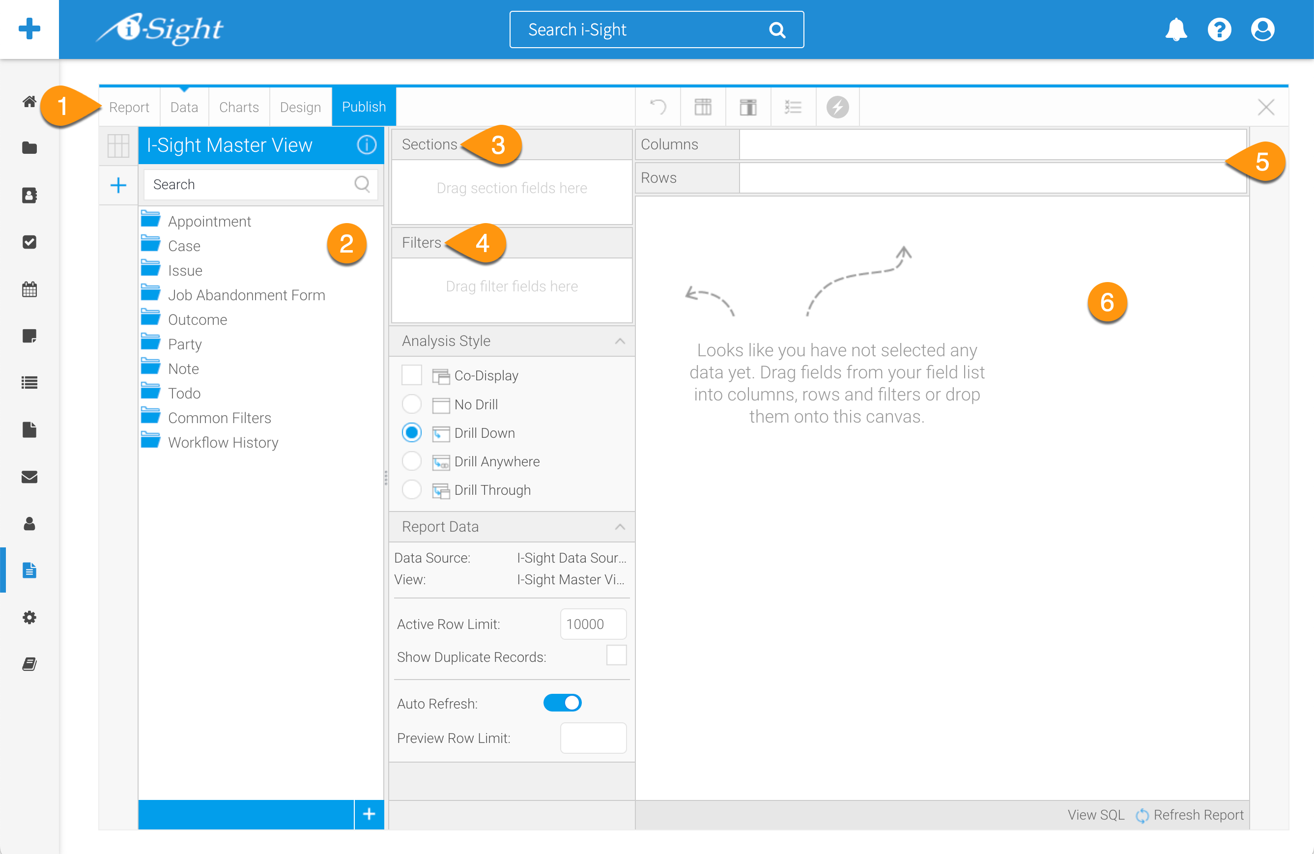
- Navigation: access the different Drag and Drop Report Builder steps by clicking the links in the navigationbar.
- Report: save your report while it is in progress, undo recent changes, or delete the report.
- Data: the main Drag and Drop Report Builder page, which will be loaded by default after selecting a view in the New Report pop-up.
- Charts: create a chart using your report data sets. Read the "Add a Chart to a Report" tab in this article for more.
- Design: see a full preview of the report and options to change the formatting.
- Publish: see the full options to save, activate, and distribute your report when you are finished working on it.
- View Fields list: the data fields that you can use for your report from the view you selected.
- Section fields: select fields to be used as sections in the report. Adding a field to Sections will create a split in the table for each value of the section field(s). Read the "Organize Multiple Data Sets" tab in this article for more.
- Filter Fields: select fields to be used as filters in the report. Values can either be defined during the report creation process or left as a user prompt. Read the "Filter Report Data" tab in this article for more.
- Table Body fields: drag fields into the Columns and/or Rows box to build the body of the report. Adding fields to both lists will create a cross tab report automatically. See more in the "Organize Multiple Data Sets" tab in this article.
- Table Preview: view a preview of the final report output. The user can also drag fields into this preview area, rather than adding them to the Columns or Rows boxes, to add them to the table. Fields can also be reordered here by dragging the field headers into position.
Add Data to a Report
To start building your report:
- Open a folder in the View Fields list to see the fields that you can add to your report. You can use the search box to find a specific field in the View Fields list.
- To add a field to your report, click and hold the field, then drag it over to the Columns box. Data in this field will now be displayed in the Table Preview. To add multiple fields at once, hold down Ctrl/Command or Shift on your keyboard while selecting fields.
- After adding fields to the report, you can hover over the field in the Columns or Rows box to display a down arrow. Click the down arrow to see more options on how to present the data, including sorting, formatting, aggregating into counts, and grouping data.
By aggregating data, Yellowfin can count the number of records in a data set, rather than displaying the value in your report.
By grouping data, you can group together two or more values of a data set. For example, if there are two case owners on the same team, you can group them together.
Save a Report in Progress
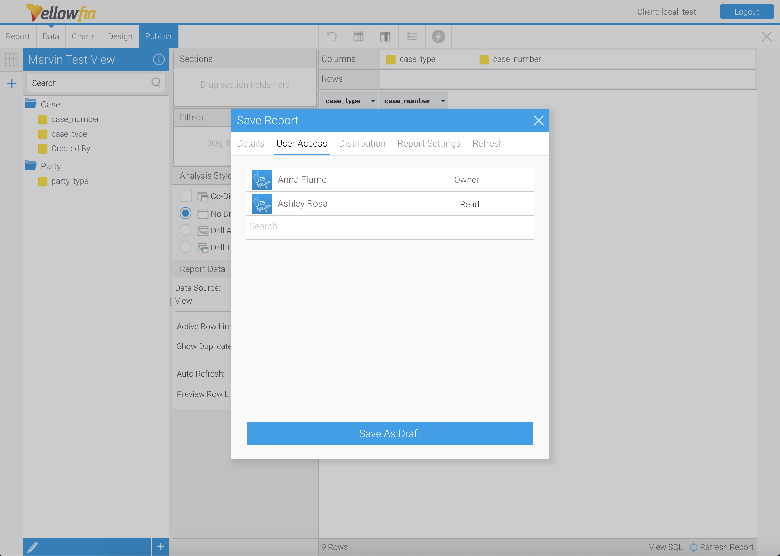
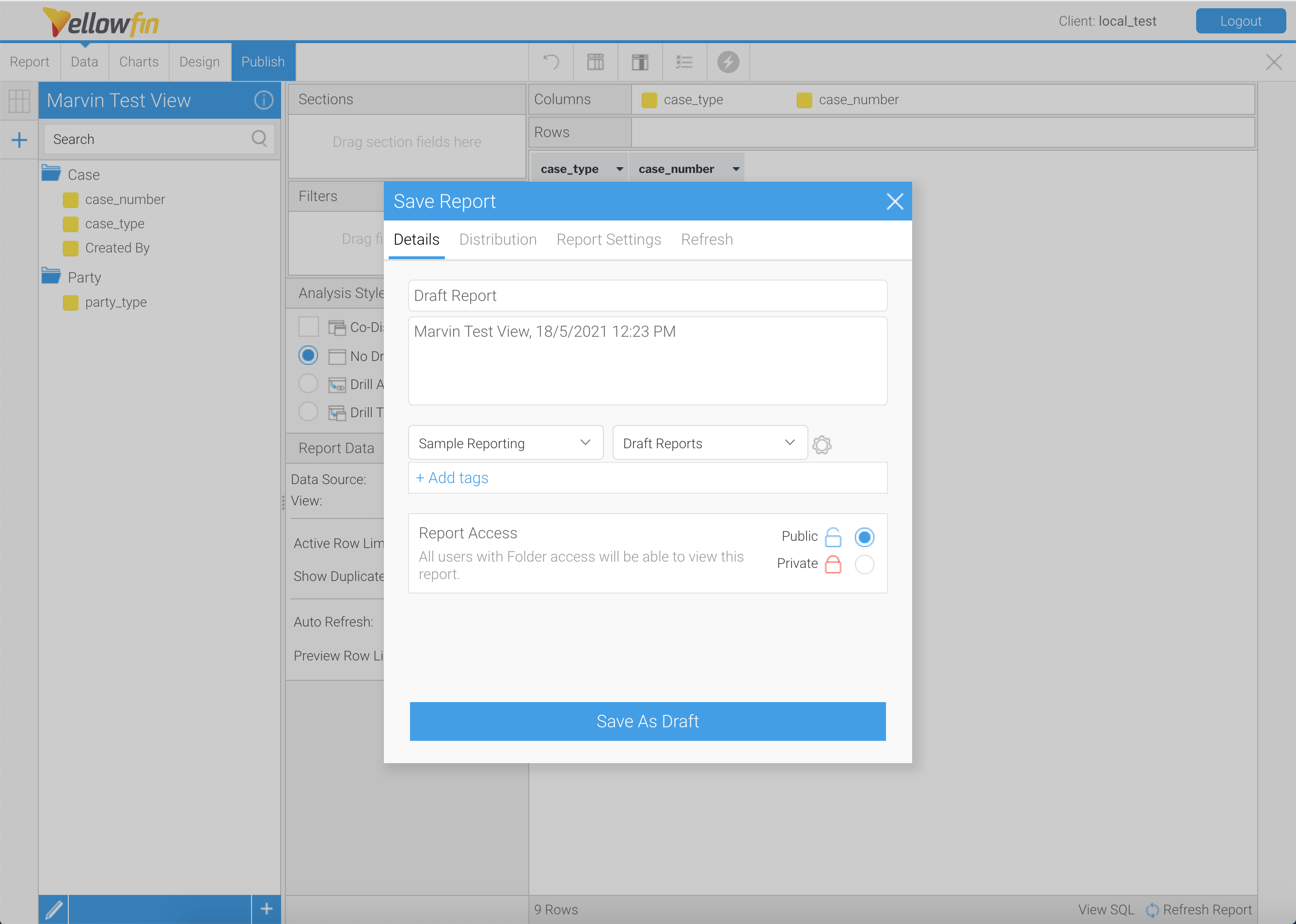
While you are working on your report, you can save it as a draft. Click the Report button to save your report. The Save Report pop-up contains many other report settings. In the Details tab, you can:
- Edit the report name and description.
- Select the folder in which the report will be saved.
- Add tags to aid teammates searching for the report.
- Set the access level for the report.
If you want to save the report as a draft without publishing, make sure to save the report in the “Draft Reports” folder so you can continue working on the report.

You can set the report's access level in the "Report Access" section in the Details tab. By selecting “Public” report access, your teammates can run the report and add the report to their dashboards. If you would like to control who can access the report, you can select “Private” report access in the Details tab. Then, click the User Access tab in the Save Report pop-up to search for and add users who can read the report.
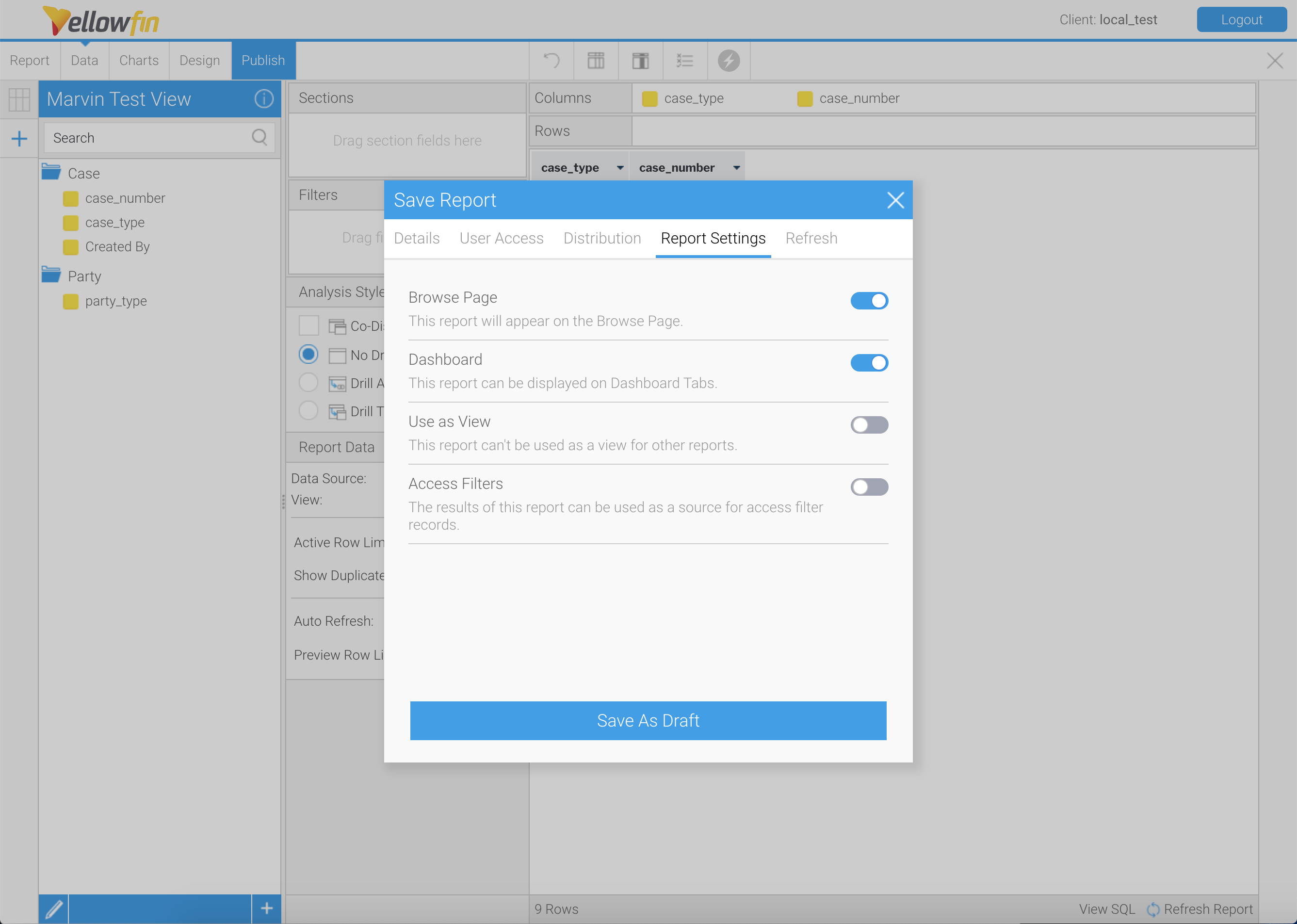
You can control additional access settings in the Report Settings tab, including if the report can be accessed on the Browse page, displayed on Dashboard Tabs, used as a view for other reports, or used as a source for access filter records.
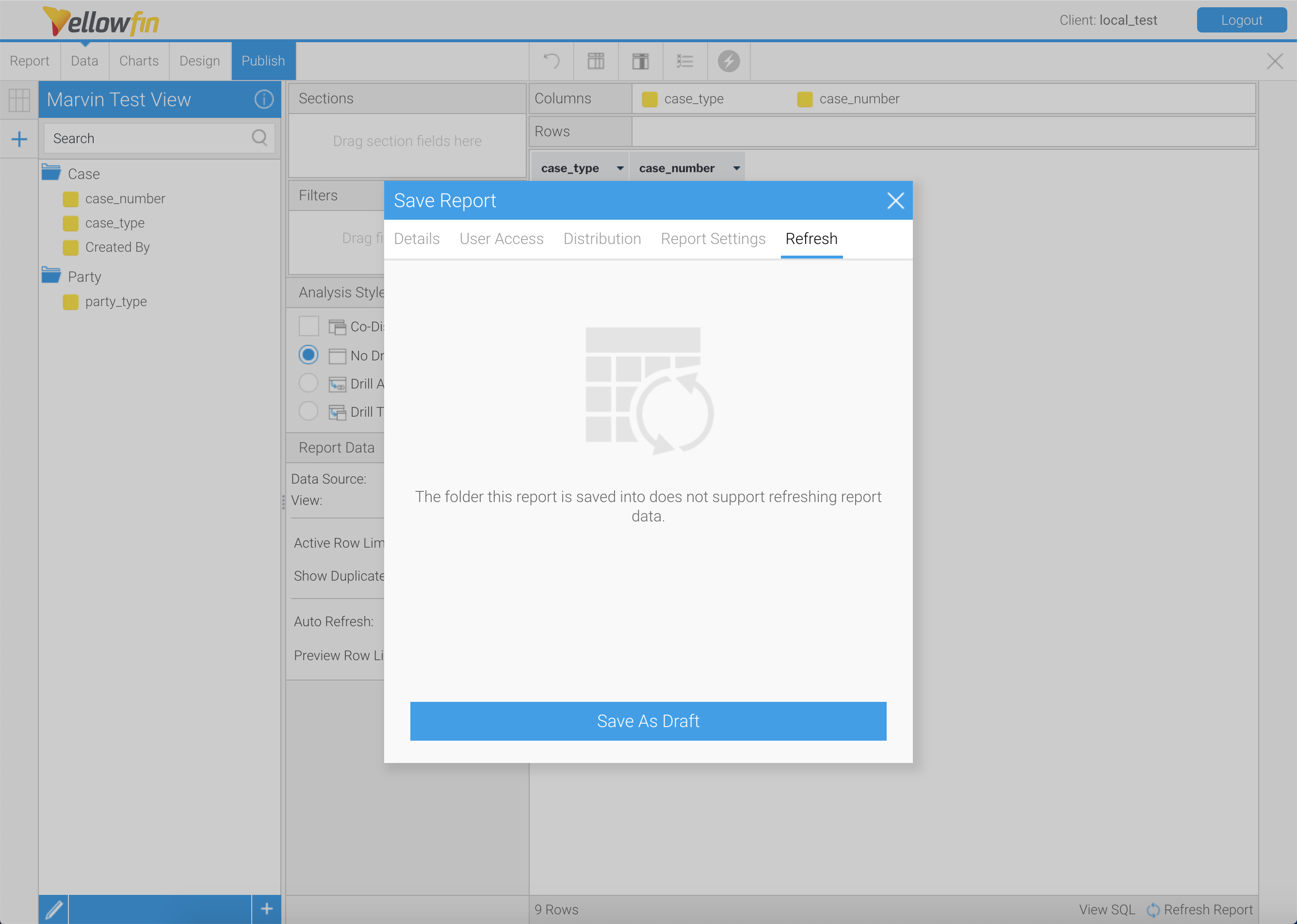
Some folders may allow you to automatically refresh report data. If your folder supports refreshing report data, you can control refresh settings in the Refresh tab of the Save Report tab. In the example below, the folder does not support refreshing report data. Read more on report refreshing in the Yellowfin Wiki article, Refreshing Report Data.
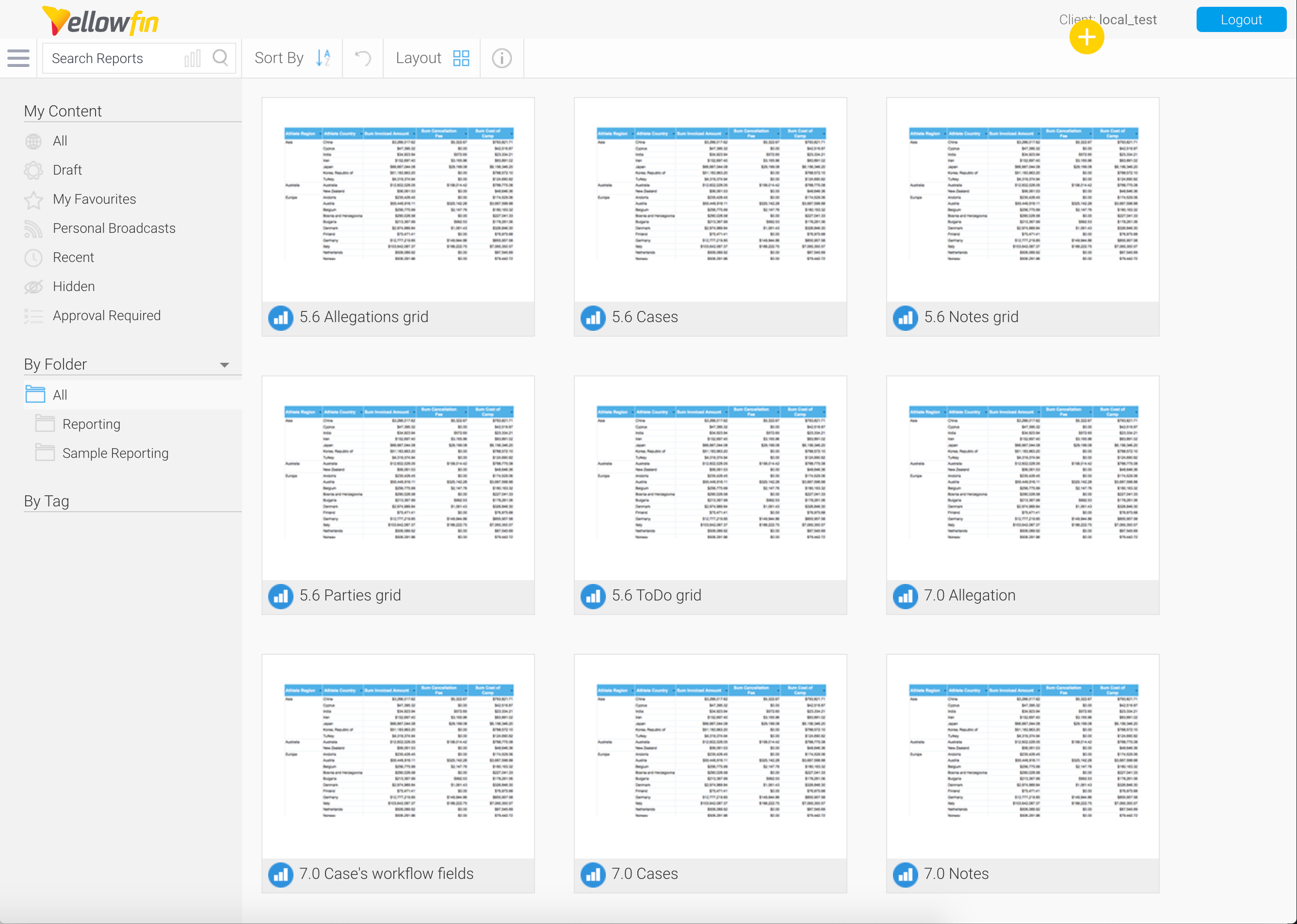
After saving your report as a draft, click the “X” icon at the top right of the Drag and Drop Report Builder to exit. The application will ask you to confirm if you want to activate the report before you exit. When you want to pick up working on the report later, the report will be available under the Browse page.
Activate a Report
When you want to activate the report, click the Report button to load the Save Report pop-up. Then, change the folder in which the report is saved. After clicking Save, the report will be active. You can now access your newly saved report in the Browse page.
Format a Report
You can adjust the font, border, column, and row formatting of the report using the following buttons on the Drag and Drop Report Builder top bar: (1) Report Formatting, (2) Column Formatting, and (3) Conditional Formatting.
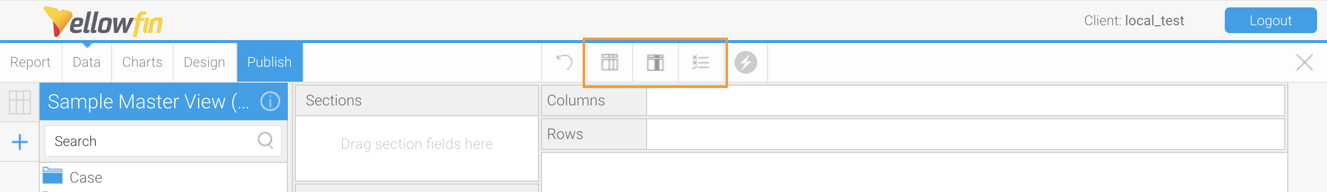
These buttons are available in both the Data and Design tabs.
Report Formatting
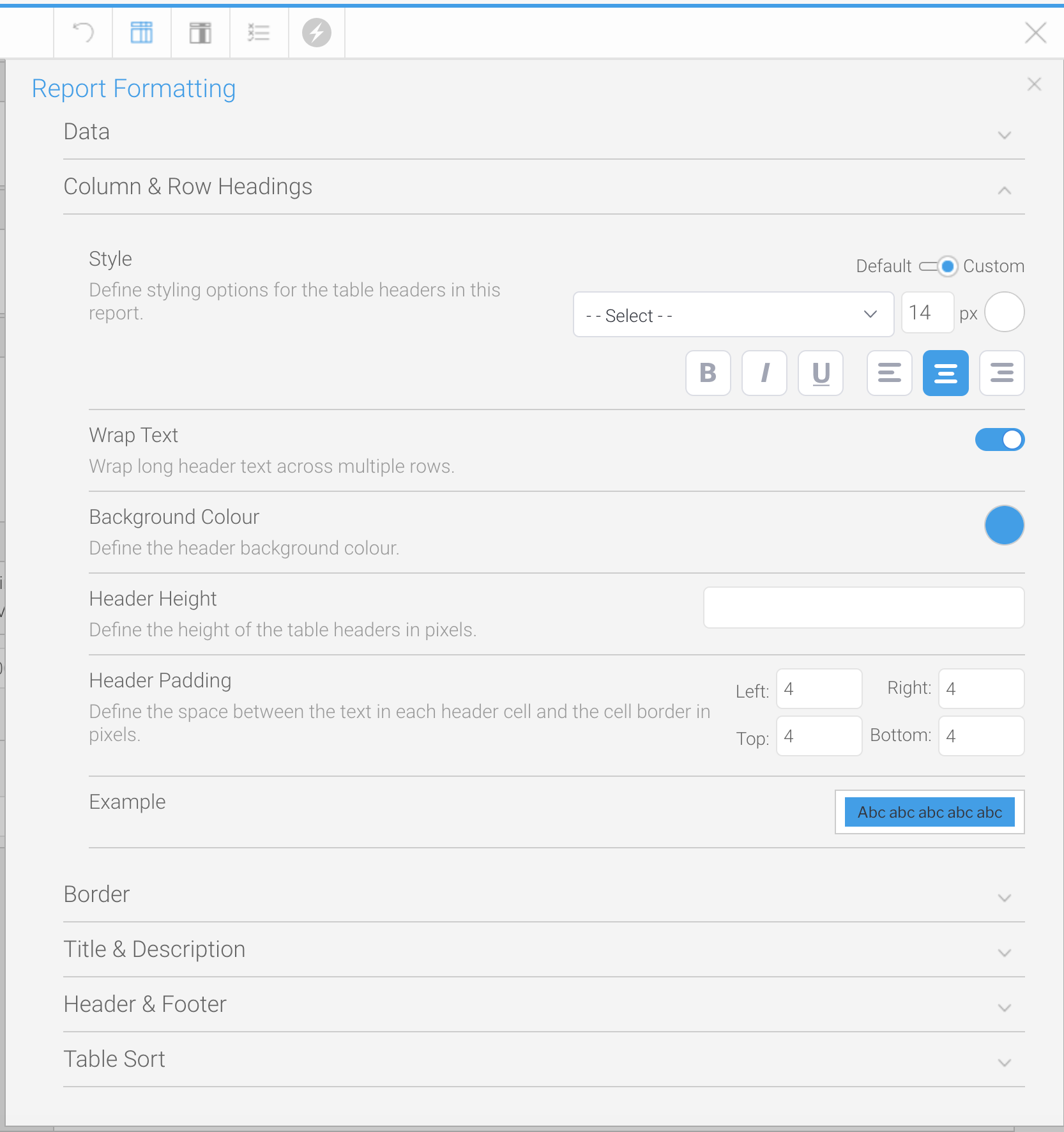
You can set formatting options for the entire report in Report Formatting, including options for font styles, background shading or colors, table borders, and cell spacing, height, and padding. The Report Formatting pop-up contains the following sections to adjust formatting of various aspects of the report:
- Data: refers to all data cells of the report, under the report headers. In this section, you can set the formatting of the report's data cells.
- Column and Row Headings: the labels of each data set.
- Border: the outer lines around the report. See the "Column Formatting" section of this article for guidance on adjusting cell borders.
- Title and Description: select if the report should include a title and description above the report data.
- Header and Footer: select what data you would like to include in the header and footer when the report is exported to another file format, such as the page number, author, and date the report was generated.
- Table Sort: the specific columns by which Yellowfin should organize the data or provide users the option to define how to sort the data when viewing the report.
Column Formatting
By clicking the Column Formatting button, you can adjust how one data set is displayed. The option to change formatting by field can be helpful when the report includes different data types, e.g. text, counts, or currency. After loading the Column Formatting pop-up, choose a column or row to format in the Report Fields section. The Column Formatting pop-up contains the following sections:
- Display: set the name of the column and if it should be displayed in the report.
- Sorting: choose what order in which to arrange the data (ascending, descending, or none).
- Data: the style of all data cells of the column under the header.
- Borders: the lines around cells in the column.
- Summary: display the total sum of a column of data or subtotals for each unique value in the column.

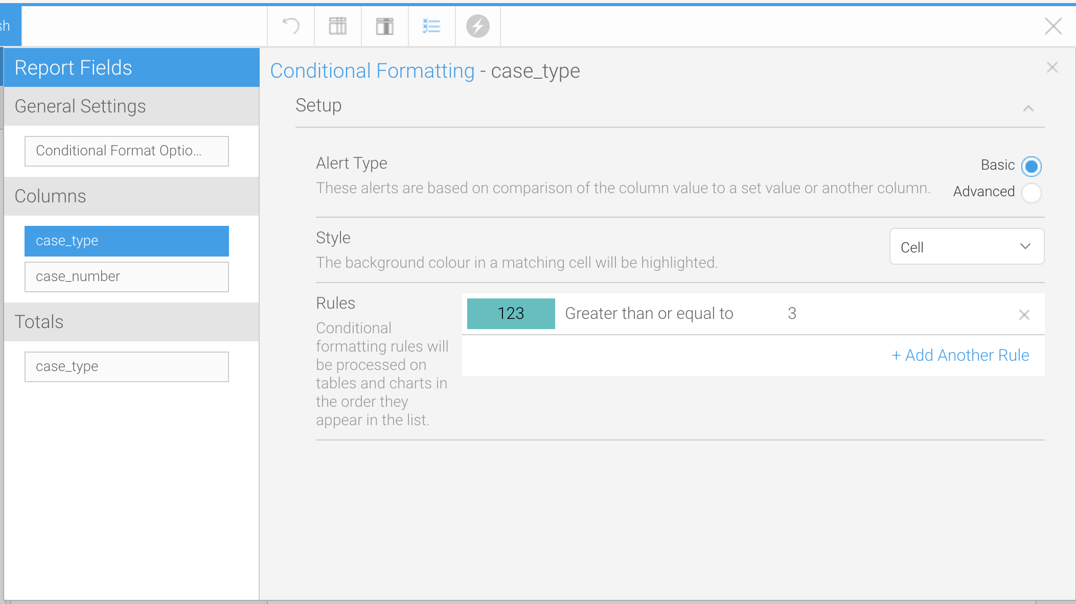
Conditional Formatting
To highlight certain cells based on their values, use the Conditional Formatting options. You can create rules to determine when a cell should be highlighted and control the formatting the system should use to highlight the cell.
To create conditional formatting rules, click on either a column or total. This article will cover how to create “Basic” alert types, which are based on simple comparisons to a set value or another column. The following options are available in the Conditional Formatting pop-up:
- Style: select whether a cell matching your conditional formatting rules will simply be highlighted or replaced by an icon.
- Rules: click Add Another Rule to get started. The Conditional Formatting - Cell pop-up will be loaded.
After clicking the Add Another Rule button, complete the following fields in the Conditional Formatting - Cell pop-up:
- Select the operator, or a logical statement telling the system how to compare the cell value to the conditional formatting rule value, in the dropdown.
- In the text box or boxes under the dropdown, type in the values that the system should use to evaluate report cell values to determine whether to highlight the cell.
- In the Style section, choose how to format cells that match the conditional formatting rule.
- Click Submit to save the rule.
- Click Add Another Rule if you want to set up another conditional formatting rule, using different criteria or formatting.
Filter a Report's Data
You can choose to limit the data displayed in the report by a data field. For example, you can add a filter based on the "Created Date" field to only show cases added in the last month in the report. As you did when adding fields to the report, click and hold a data field from the View Fields list, then drag and drop the field into the Filters box. You can add multiple fields to the Filters box.
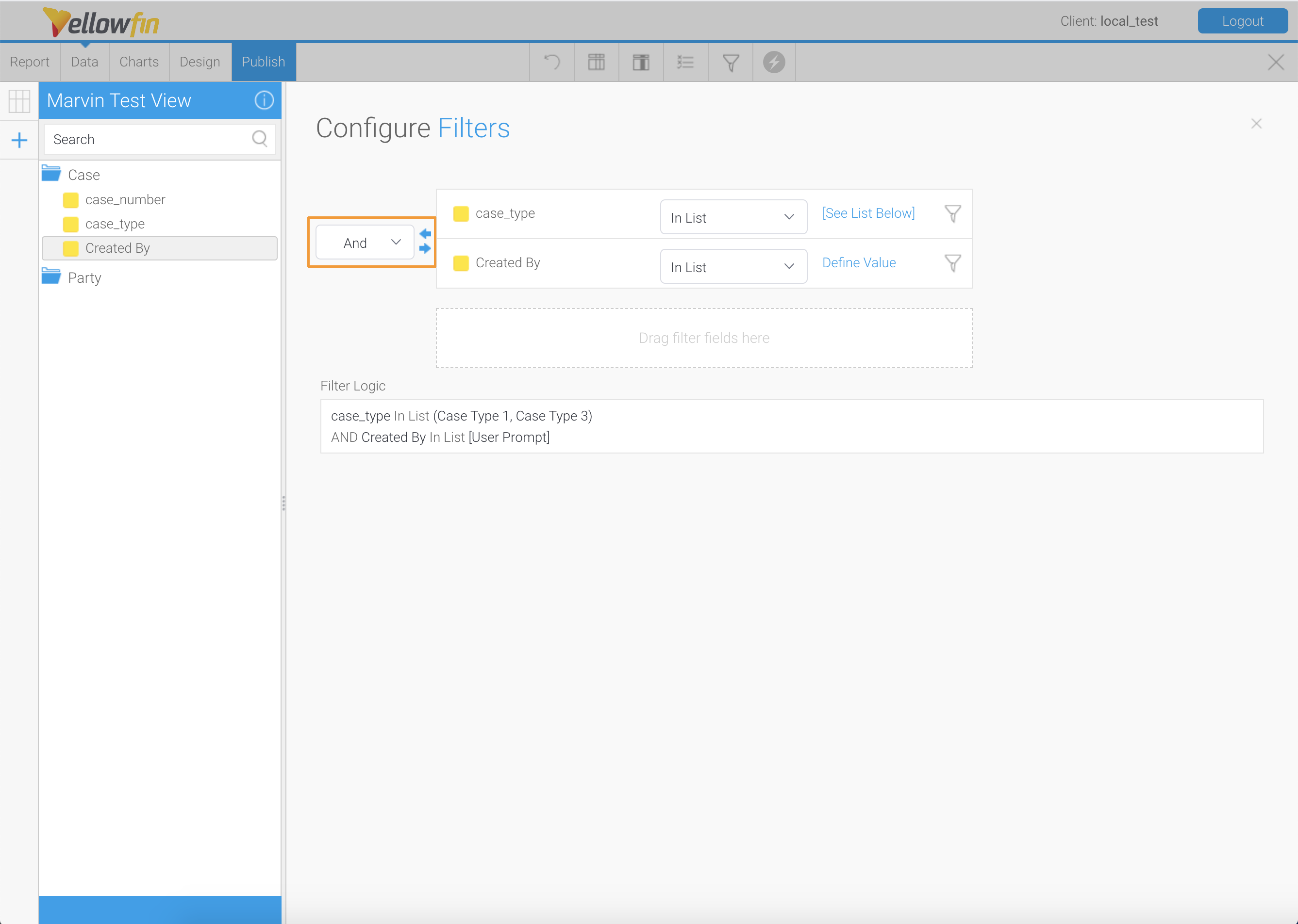
You can access the filter configuration options by (1) clicking the down arrow beside a field (on hover), or 2) clicking Advanced Settings to load the Configure Filters modal. You have access to the same options in either method but the Configure Filters modal will be used in this article for demonstration.
To set how Yellowfin should narrow down the data in the Configure Filters modal:
- Hover over the field to see how you can aggregate the field values.
- Select the operator or a logical statement telling the system what values for which to filter, in the dropdown.
- Click the link to select the value for which to evaluate the statement. You can choose:
- User Prompt: allow users on the front-end to set the filter values before running the report. You can preview the User Prompt pop-up on the Design page, as shown below.
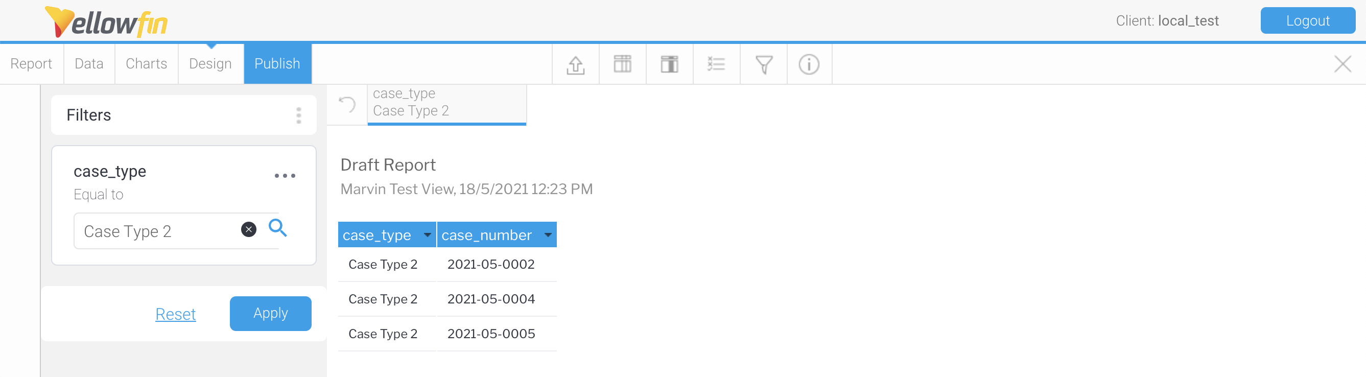
- Defined Value: manually set the value(s) for the filter.
- Pre-Defined Period: for date or date time fields, select a range of time from Yellowfin’s preset options, e.g. “Last 5 Minutes”, “Previous 7 Days”, “Today Minus 3 Months”, “This Calendar Year to Now”, etc.
- User Prompt: allow users on the front-end to set the filter values before running the report. You can preview the User Prompt pop-up on the Design page, as shown below.
- If you drag multiple filter fields into the Filters box, you can select an operator between the fields.
- If you select “And”, the data must match both filter statements.
- By using “Or”, the data will only need to match one of the filter statements.
- Click “X” on the modal to exit. Your filter configurations will be saved automatically.
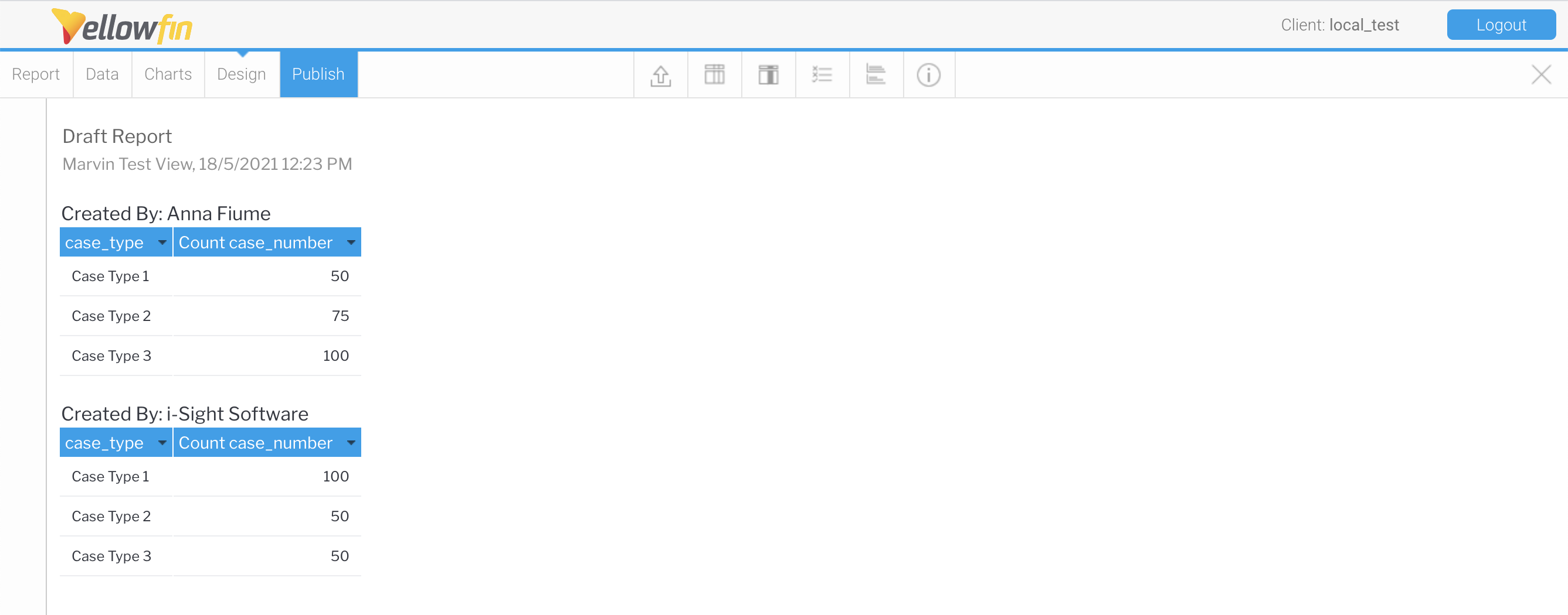
Organize Multiple Data Sets
You may want to create a report that clearly presents multiple related data sets. In particular, you can organize your report by showing values at the intersection of rows and columns, showing the relationship between 2 or more data sets, in a "cross-tab" report.
First, set one of your report's fields to aggregate data, such as the Case Number field. Hover over the field in the Columns or Rows box to display a down arrow. Click the down arrow and hover over the "Aggregation" option. Then, select "# Count" or "# Count Distinct". Yellowfin will now display the number of records in a data set, rather than displaying the value.
Next, move one of your fields to the Rows box to create a cross-tab report. The data from one field will now be displayed in the columns and the data from another field is included in the rows.
You can further organize your report by adding sections, so you can display a table with your column and row fields for each category you set. Drag a field from the View Fields list into the Sections box. See the following example taken in Design mode.
Add a Chart to a Report
You can create a chart to visualize the data presented in the table of your report. The chart will be displayed alongside the table of data when the report is generated and you can control the layout of the chart and table.
First, set one of your report's fields to aggregate data, such as the Case Number field. Hover over the field in the Columns or Rows box to display a down arrow. Click the down arrow beside the field and hover over the "Aggregation" option. Then, select "# Count" or "# Count Distinct". Yellowfin will now display the number of records in a data set, rather than displaying the value.
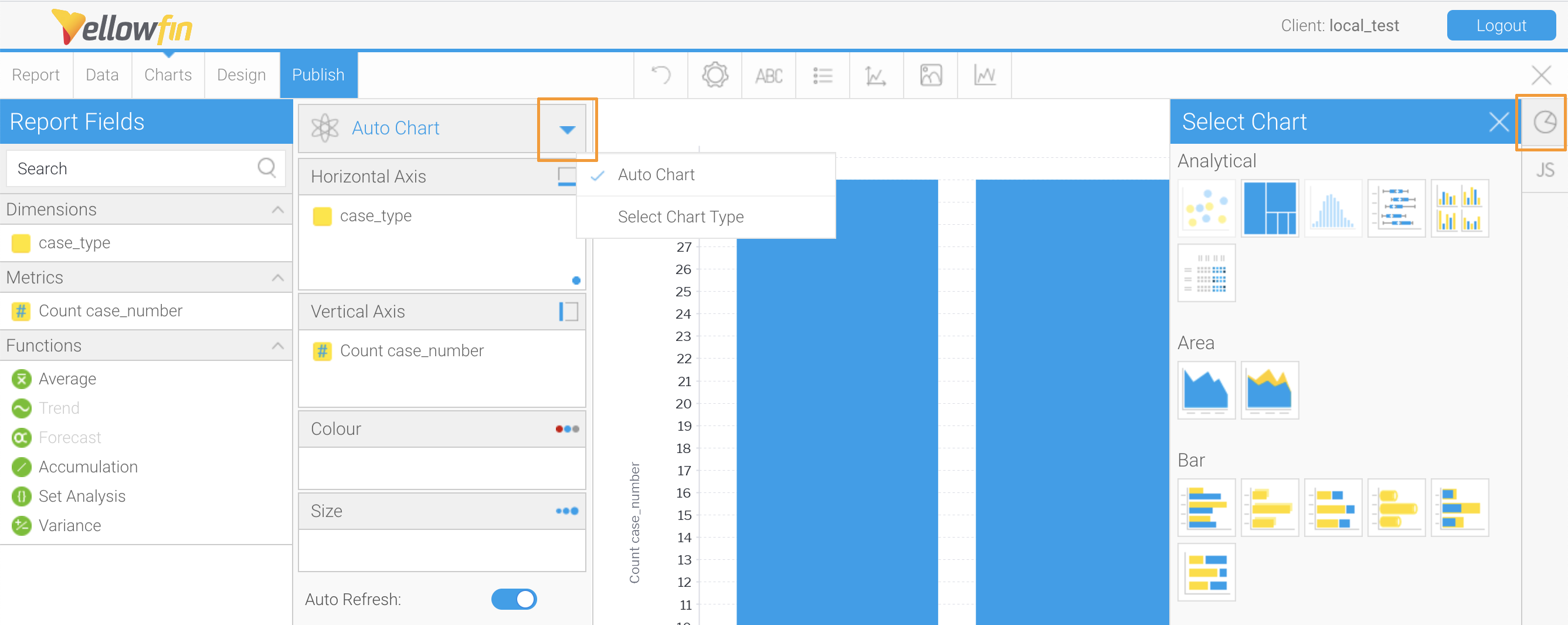
Next, click Charts on the Drag and Drop Report Builder page. Similar to the Report Builder, drag fields from the Dimensions box to the Horizontal and Vertical Axis boxes. A preview of your chart will be displayed in the open space.
Yellowfin will automatically select a chart type based on the data types of fields added to the chart but you can specify a chart type by clicking the down arrow in the “Auto Chart” section or the Pie Chart icon in the right sidebar, which are highlighted in the screenshot below.
The top bar above the charting section contains options for formatting your chart, including:
- Chart size, position, and style settings.
- Title.
- Legend.
- Axis settings (separate options for horizontal and vertical axes).
- Background chart area and border.
- Series settings (sorting by data fields).
You can add multiple charts in a report. Click the Plus button at the bottom of the page to create another chart.
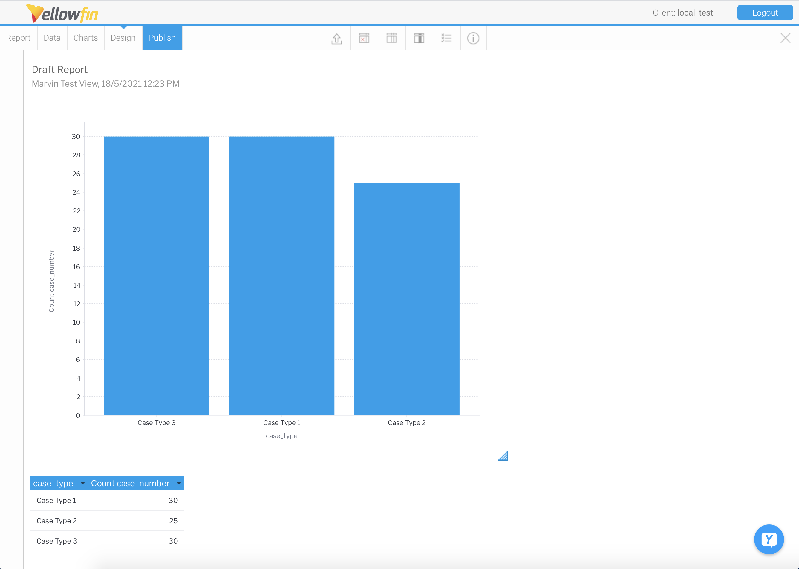
When you click “Design”, you can see what your report will look like with the table and chart you created.
If you created multiple charts, you need to indicate where the charts should be placed in the report page before you can see them. Click the Pie Chart icon to see your charts. Click, hold, and drag a chart from the sidebar into the report page and let go of your cursor when it is in the desired position.
Delete